IndieRocks!
Re-Imagining the biggest and more influential music outlet in Mexico
IndieRocks! needed to connect with the younger alternative Mexican audience.
One of the user research results was the need to increase the young audience's attraction. The website had to look attractive, modern, and easy to navigate.
To improve the user experience on the site, I analyzed all the existing content and categorized it using different taxonomies to allow the visitor to find more content easily. With this approach, the user's time on the site increased by around 15%.
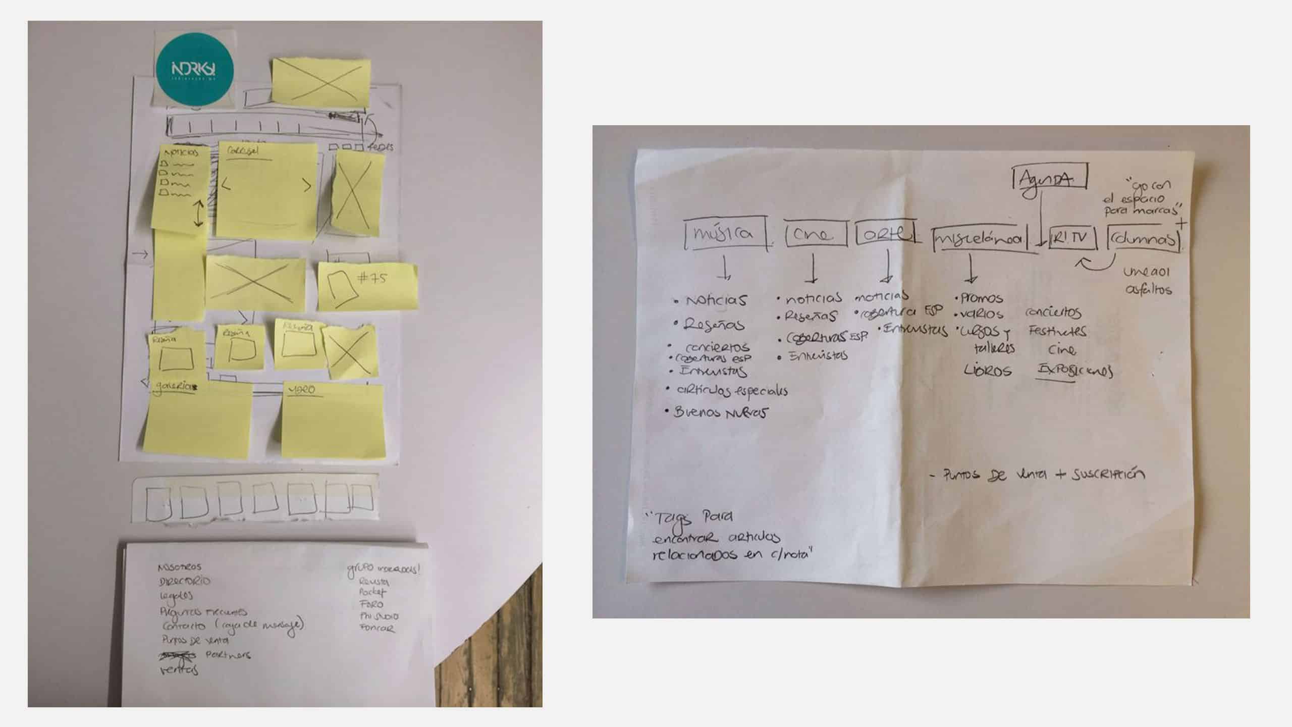
IndieRocks! Taxonomy Organization
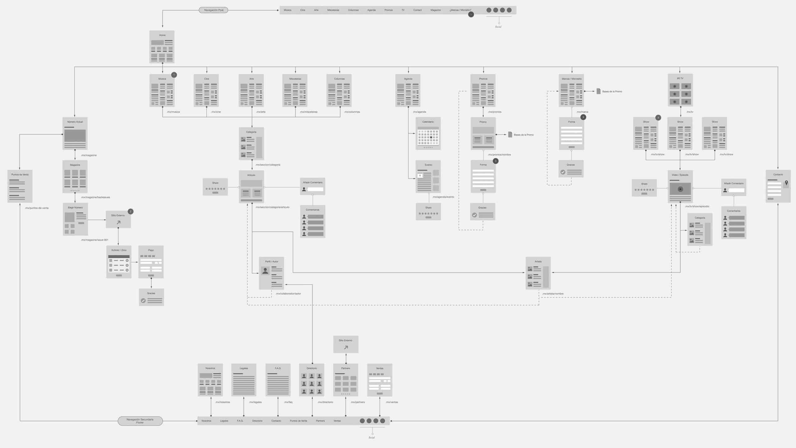
IndieRocks! Navigation
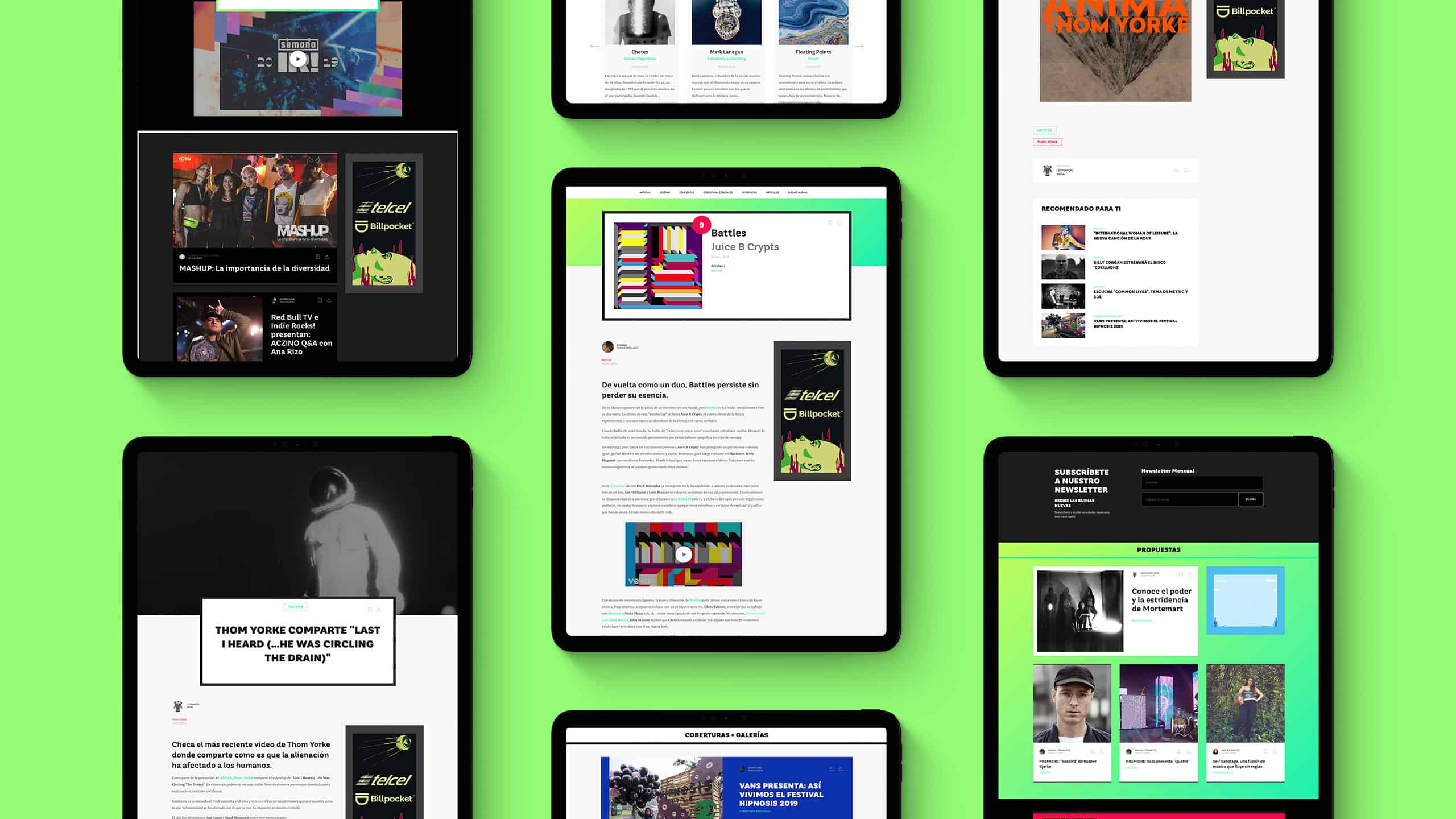
Once all the content had its own taxonomy, I analyzed the goals and analytics Indie Rocks! had, and I designed each section, article, and taxonomy using components.
Thinking about the design of the components as a unit instead of as part of a section or page allowed me to create independent organisms that the dev team and I could re-use on different segments of the site. At the same time, using these organisms kept the site consistent since it followed an established guideline.
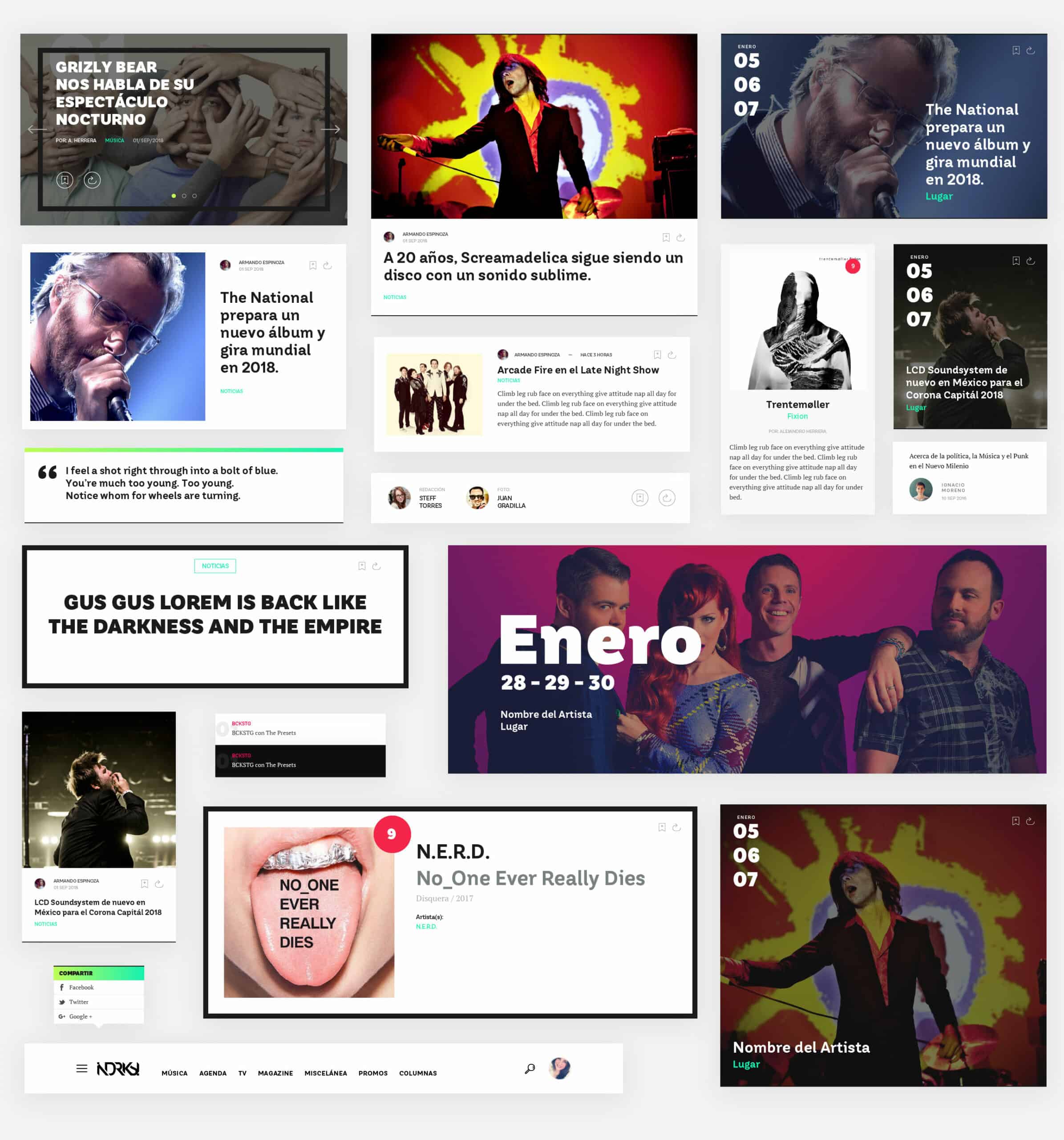
IndieRocks! Components
For this project, in particular, the user persona was evident. But even that "defined" persona had different demographics and behaviors.
I separated the obvious into three distinct personas.
- 1) Fresh ears: Visitors in their 20s. They scan the site fast until they find a headline of a band that will perform at a festival or is very hip. They are attracted by graphics and media and rarely read an article.
2) I know bands: Visitors in their late 20s and 30s. They scan the site for news on the newest music and read only the articles of the hip bands and musicians. Attracted by opinion articles and record reviews.
3) The X-Gen: Visitors in their 40s. They tend to consume and read articles of known bands and use the search feature to find news on their favorite musicians. Attracted to record reviews to learn about new music.
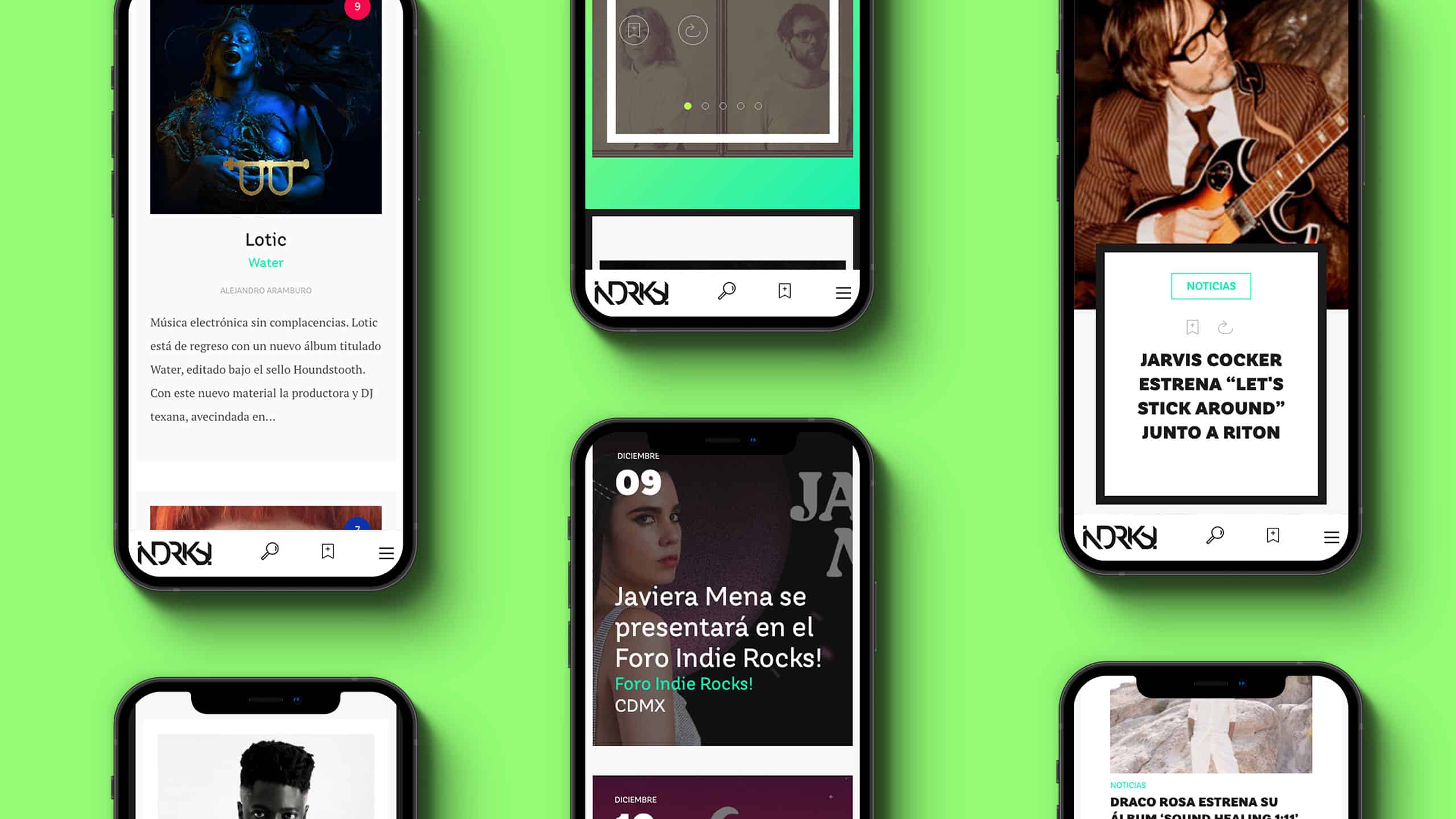
IndieRocks! Mobile Design
Once the design was ready, I made a prototype with InVision and asked 12 people, 4 of each user persona, to use the new design while sharing their screen. Overall, the feedback was great. The more significant concern was the readability of the articles, so I took notes and made adequate adjustments.
I handled the dev team code examples of all the components, in HTML and SCSS, along with rules for visual attributes, font sizing, and clear naming conventions for each component and its variations.
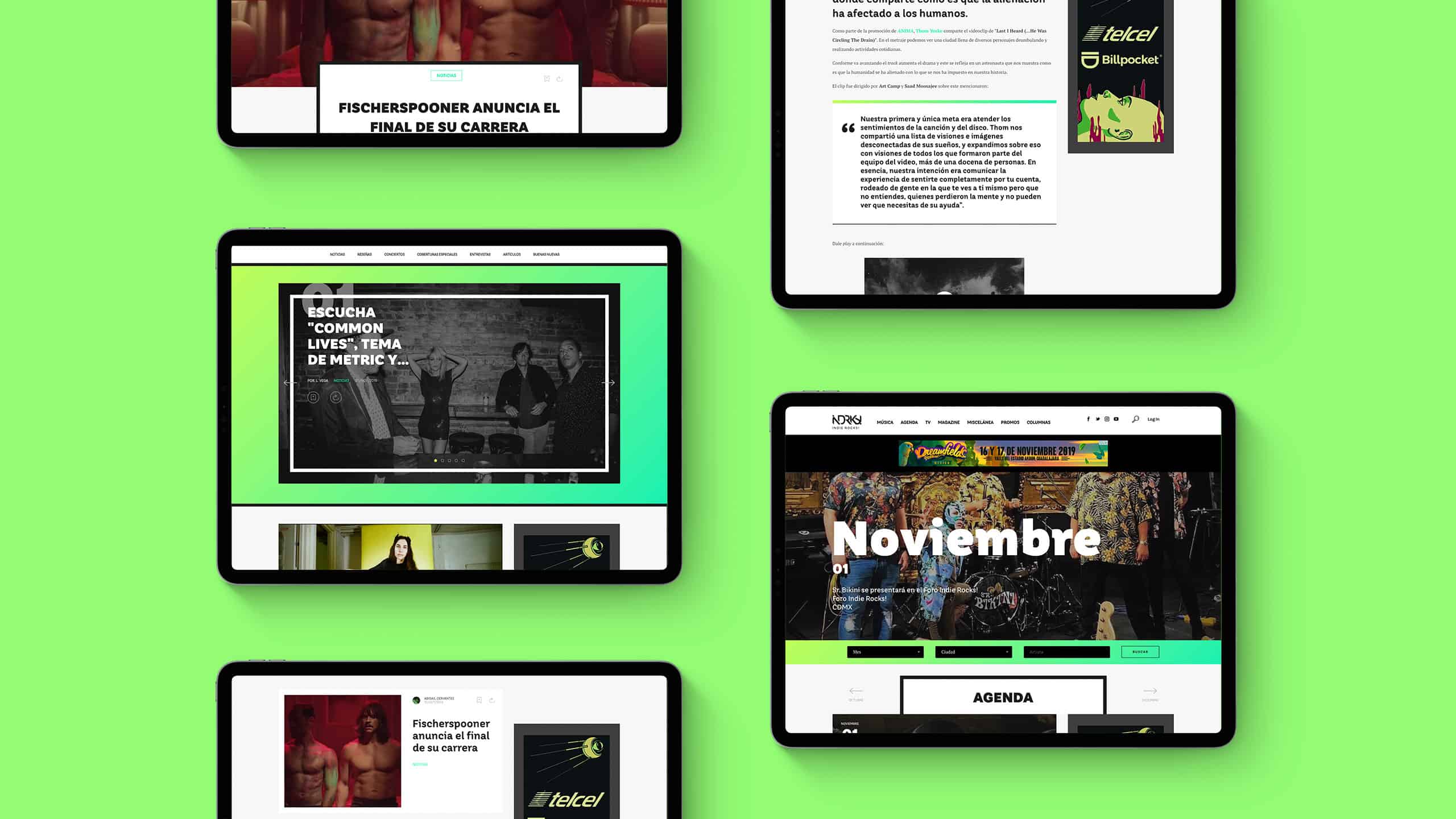
IndieRocks! Agenda
Even when the site has a lot of attractive sections like music reviews, interviews, concerts, and columns, the most visited section is and was the Agenda.
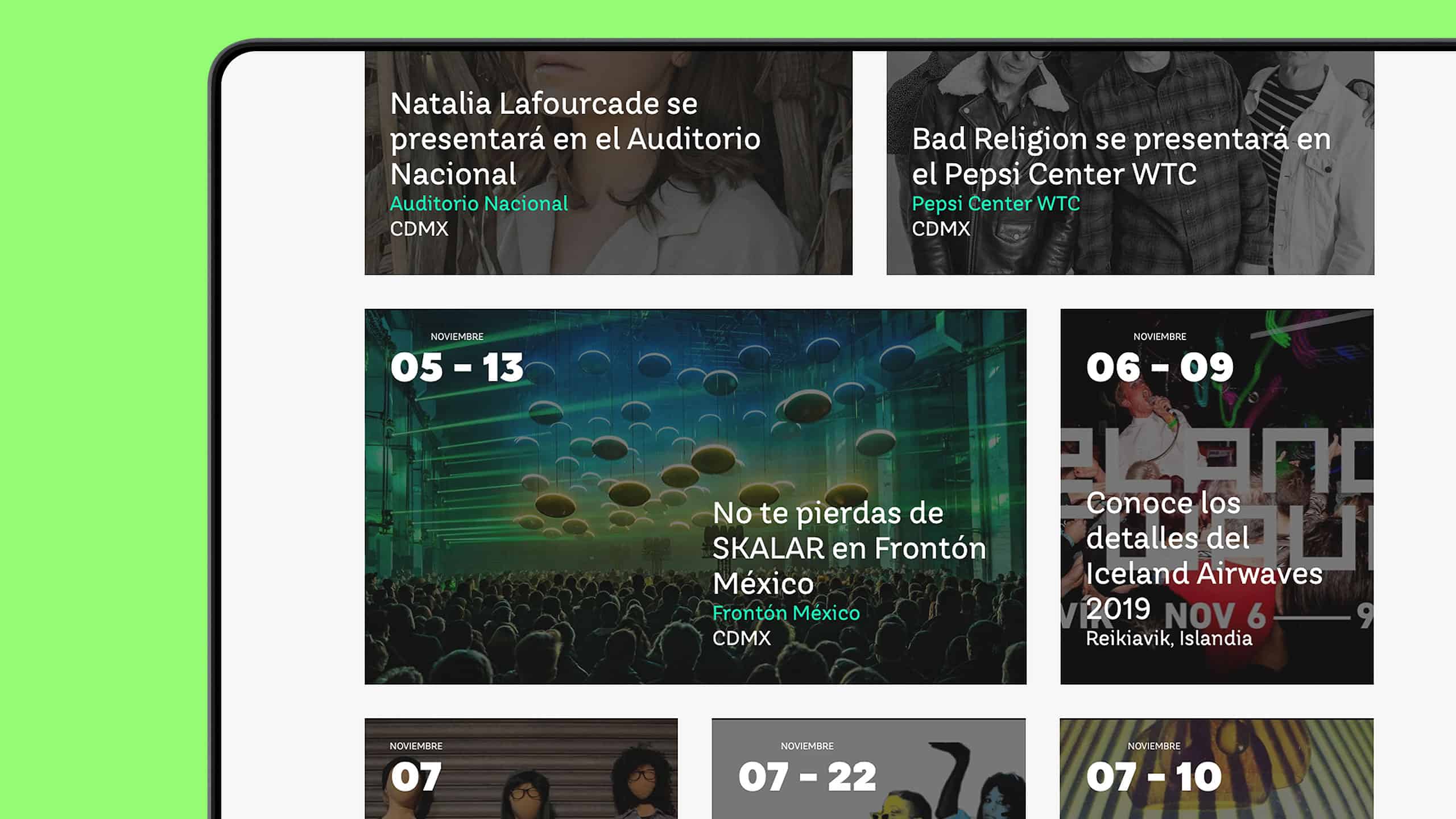
As you can imagine, the amount of events in Mexico City is massive, and the IndieRocks! team wanted to present the events graphically.
I solved this by breaking the event list by month, then by day, and finally, organizing everything to look like a calendar featuring the information for each event. Using a known pattern like the calendar made the navigation of the Agenda super intuitive and allowed the visitor to find events easily.
IndieRocks! Agenda
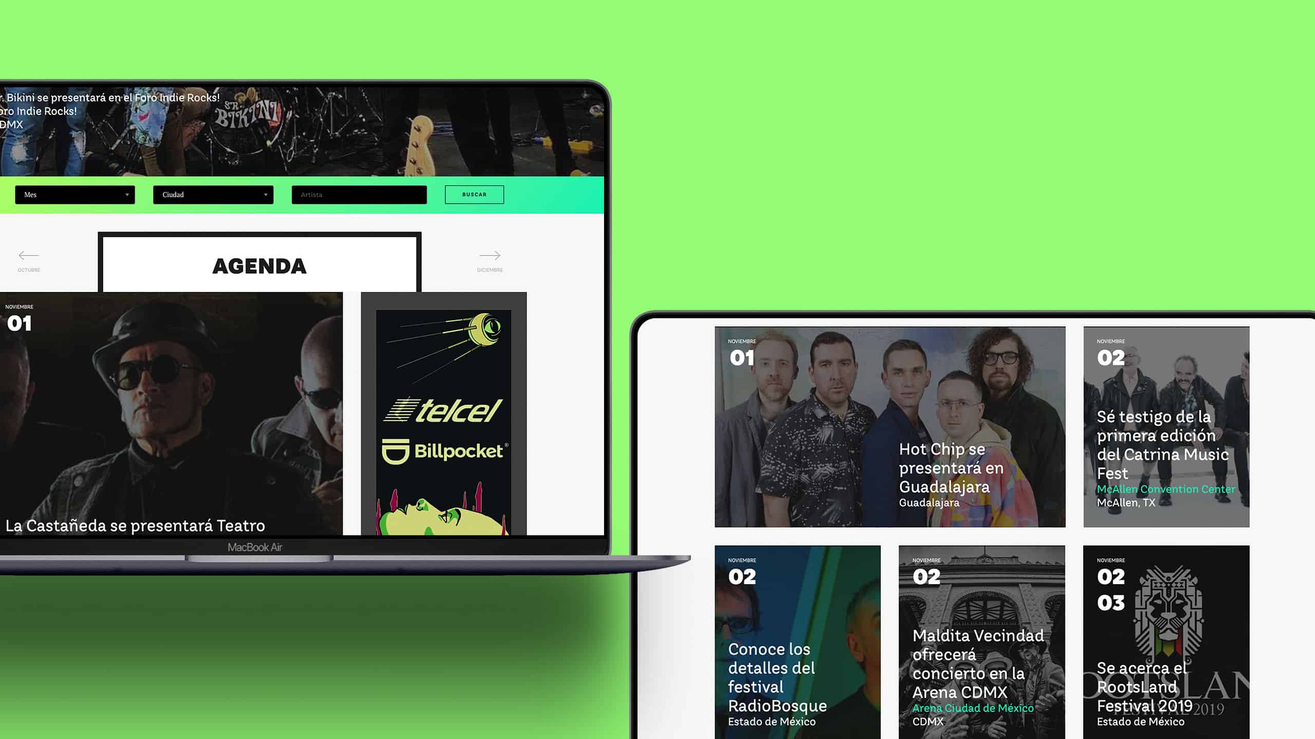
When we were testing the Agenda, I noted the visitor experience could be improved a little more, so I made the navigation simpler and gave the visitor a way to find and filter the events.
To improve the navigation, I included a simple search bar with three options, a month selector, a city selector, and an input area to write down the artist. Additionally, I incorporated two arrows that allow the visitor to go to the next and previous month.
IndieRocks! Agenda
There was another problem that needed to be resolved. The time spent on the site was not great; looking at the analytics, visitors tend to consume an article and leave the website. I asked 8 people to navigate the website while I watched.
Before observing them, I noted a clear pattern: there wasn't an option to continue navigating the site once they finished the article. My proposal included a recommendation system and loading the following article while scrolling down. These two features increased the time on site by 20%.
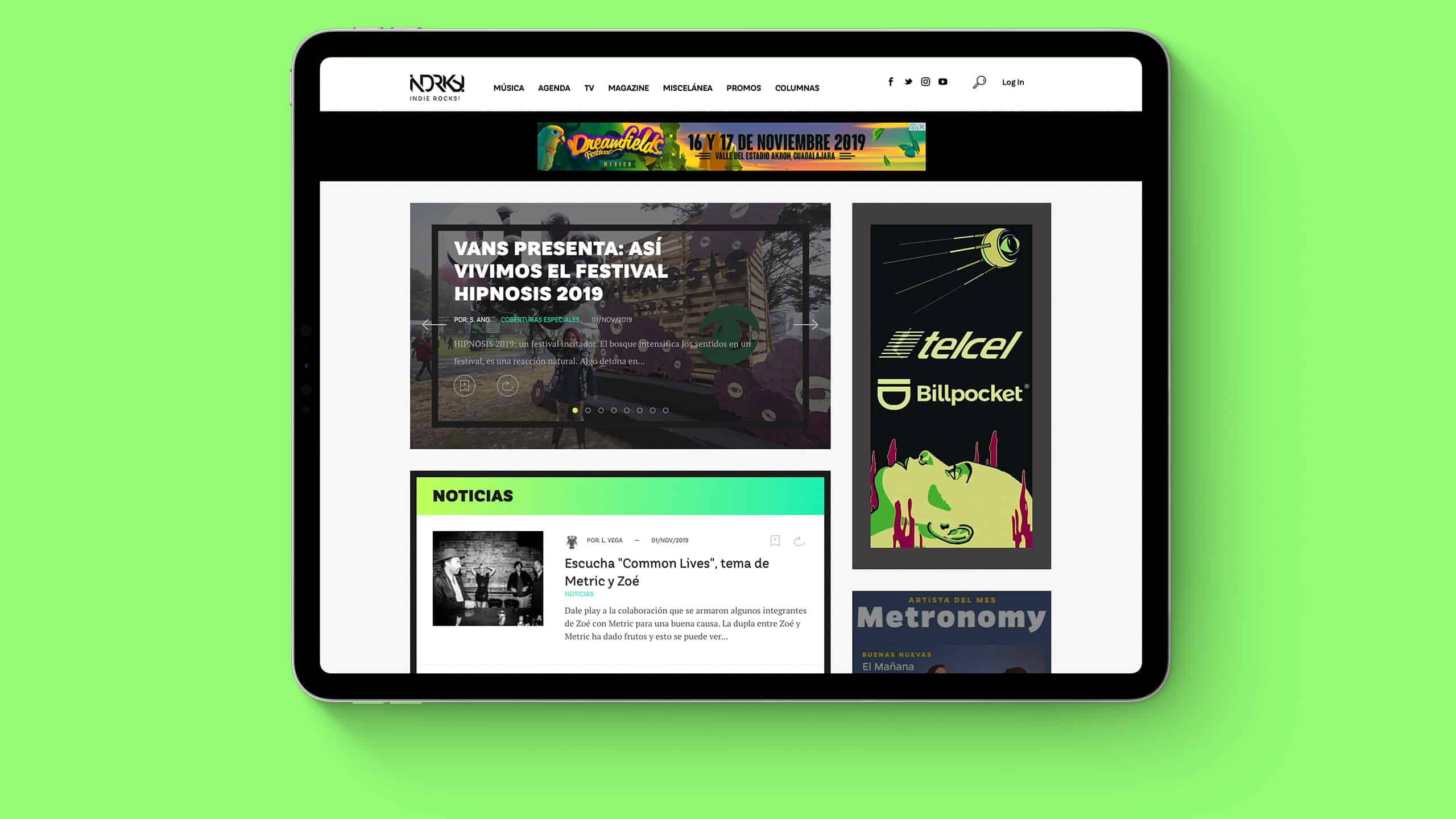
IndieRocks! Website Design
Even with an exciting project like this, there is a lot of friction with clients. But, as designers and developers, our work is to find the best solutions for every project.
The design of the IndieRocks! website, definitively took the magazine to a new level of professionalism, allowing the brand to successfully move to the digital space by increasing the site's visits and revenue, eventually replacing the monthly print magazine.
Team
Luis Morenoui/ux designer & font end developer,
Ignacio M.lead developer, Juan G.developer,
Armando E.copywriter
Wanna say hi?
mail: luis[at]chicharitomagnetico[dot]com
text: +52 322 158 2754