MLSVallarta
Members Area.
Giving the brokers and agents digital tools for promoting their properties.
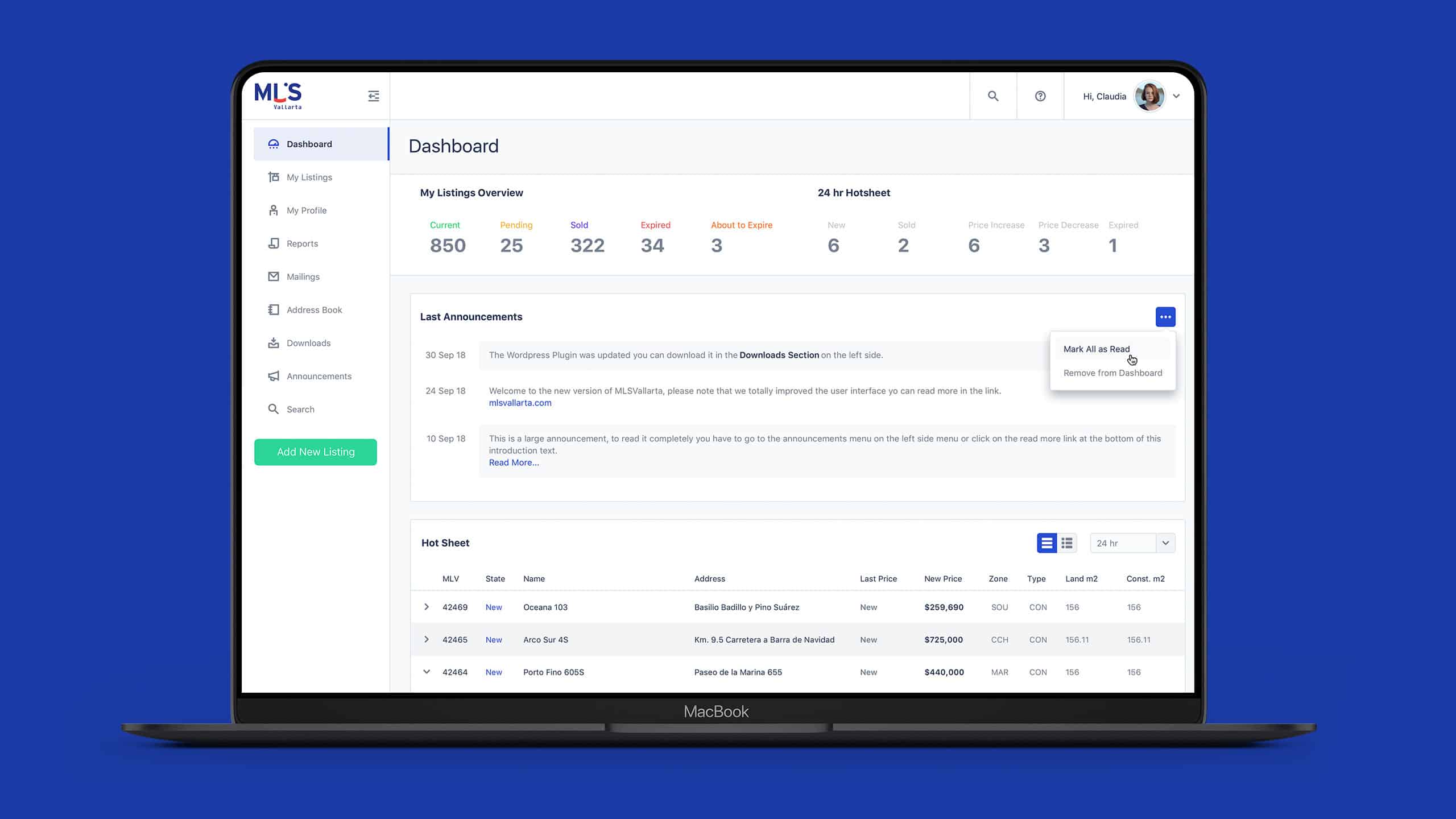
MLSVallarta was the first multiple listing system in Mexico (1988).
The challenge was to renew the software and create an easy way for agents to work and collaborate between them.
When the client explained his idea of change, I got excited, but I never thought about all the work the team would do to complete the project.
I must say it was an adventure.

Original Design
Background
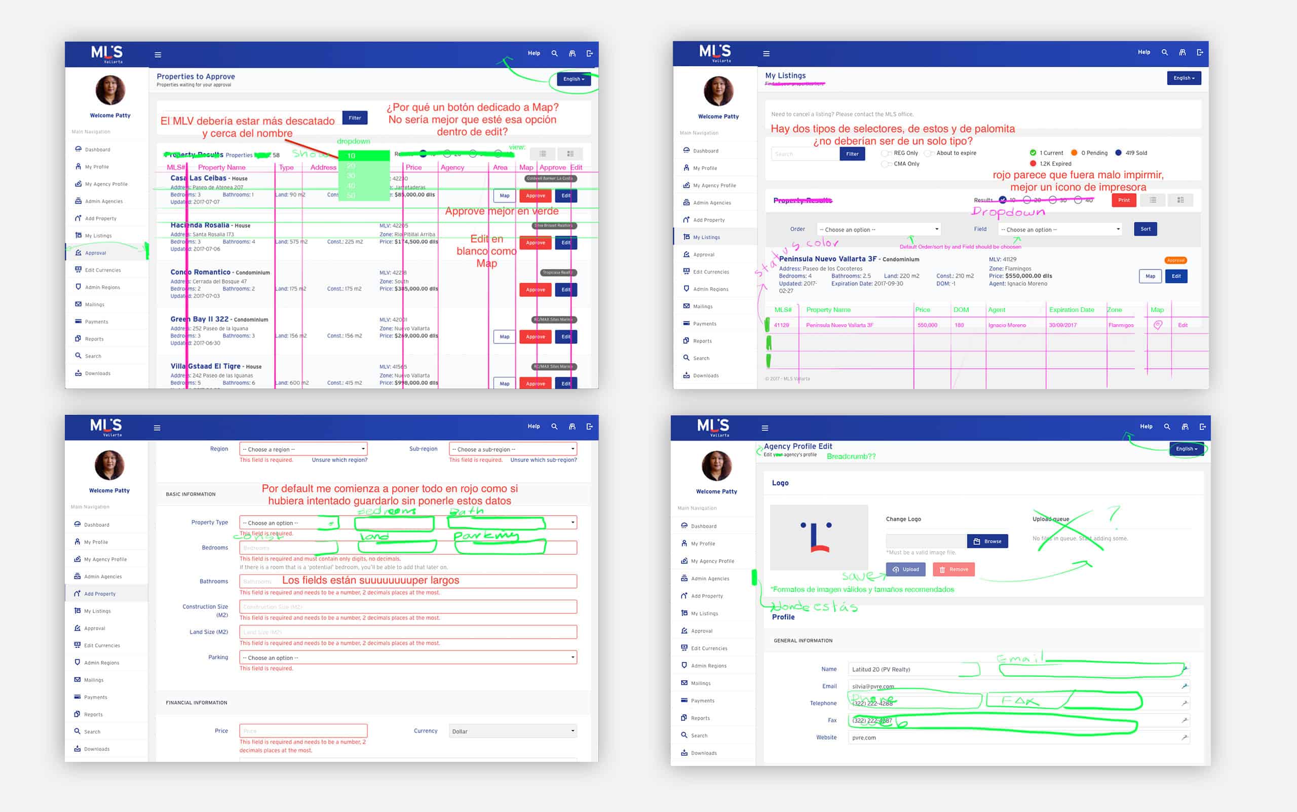
We began our journey by researching how the current software worked, what could be improved, modified, and changed.
The software looked confusing and outdated; some of its features didn't work as intended, but agents were used to it and were reluctant to change.
- In the words of one of the agents:
"It just works."
The sprint was short, and the dev team suggested we should focus on the technical side to deliver the product on time.
Business Goal
Retain and increase the number of members on the platform by improving the software and modernizing the company's overall look.

Original Design
Research
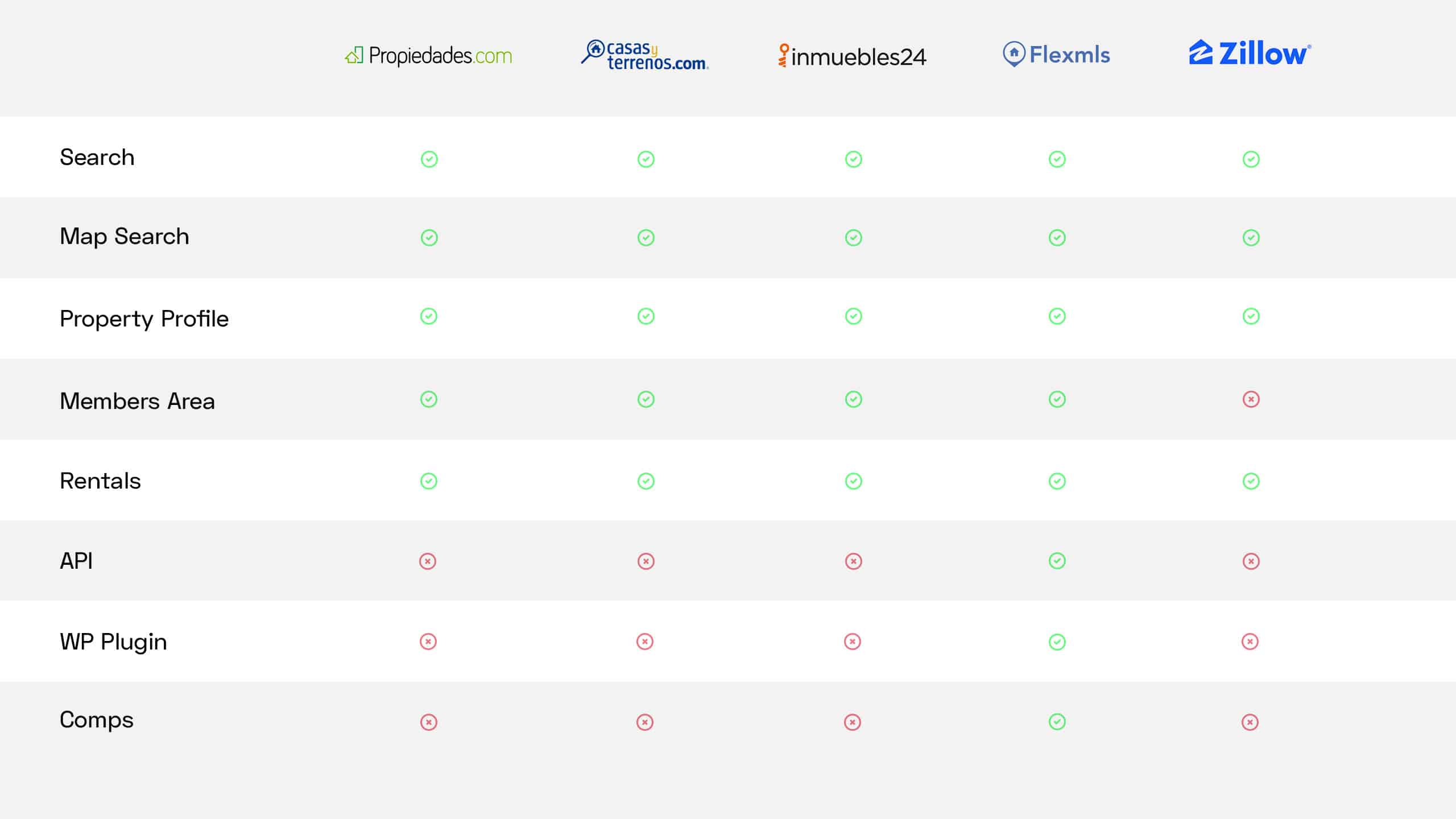
A competitive analysis gave us the foundation to plan all the software features and helped us identify the must-have tools and sections.
Personas
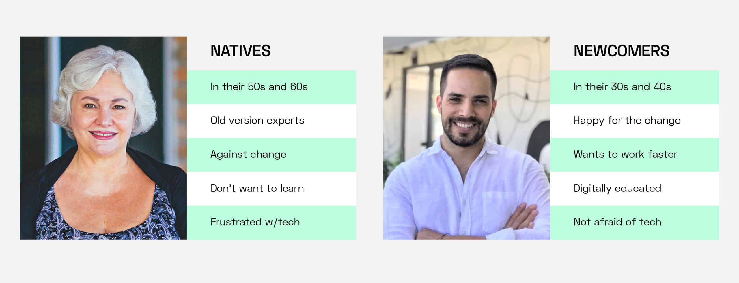
Based on the analytics and the users' demographics, we divided our user personas into two groups. Natives and newcomers.
Natives were hardcore users of the old version of the software, and most of them were against change because they didn't want to "learn" to use the tool one more time. Some of them were even afraid of what could happen if they did something wrong.
Newcomers were agents in the 30s and 40s, they were happy with the idea of having a new version of the software, and their feedback was more focused on adapting the tool to make things faster.
Space
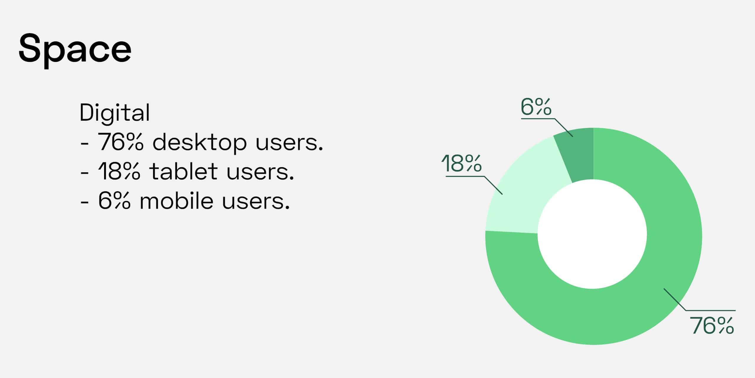
The data available at the moment showed that a large part of the agents was using the software on their laptop or desktop computers, and just a tiny amount of them were using either their tablet or mobile devices.
At this point, we had a clear idea of what we needed to do. I started to work on the data layout doing lo-fi wireframes.
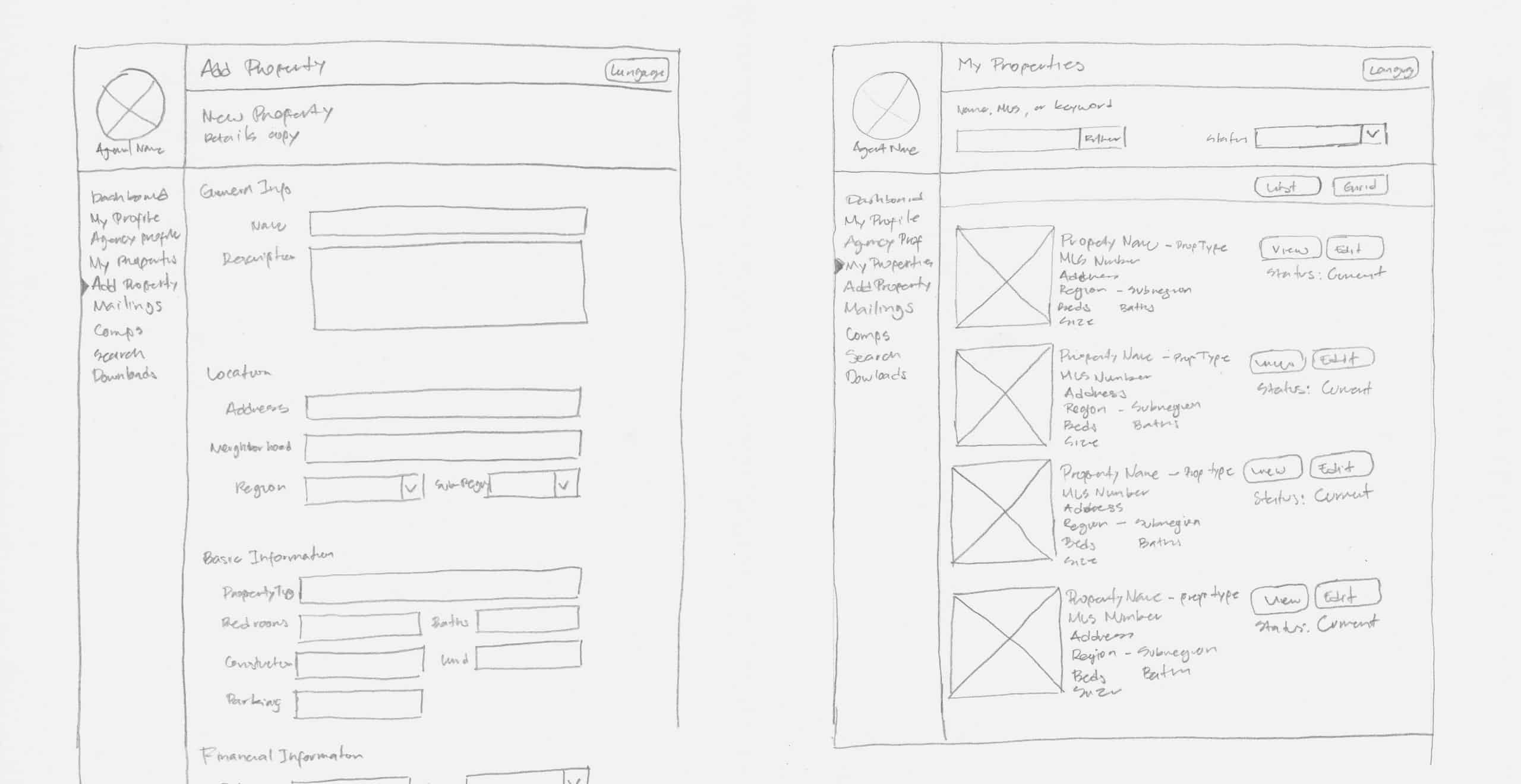
Lo-fi Wireframes
The client's main goal was to move away from the old version of the software rather than improve or make changes to it.
We decided the best solution was to build a working prototype to achieve this.
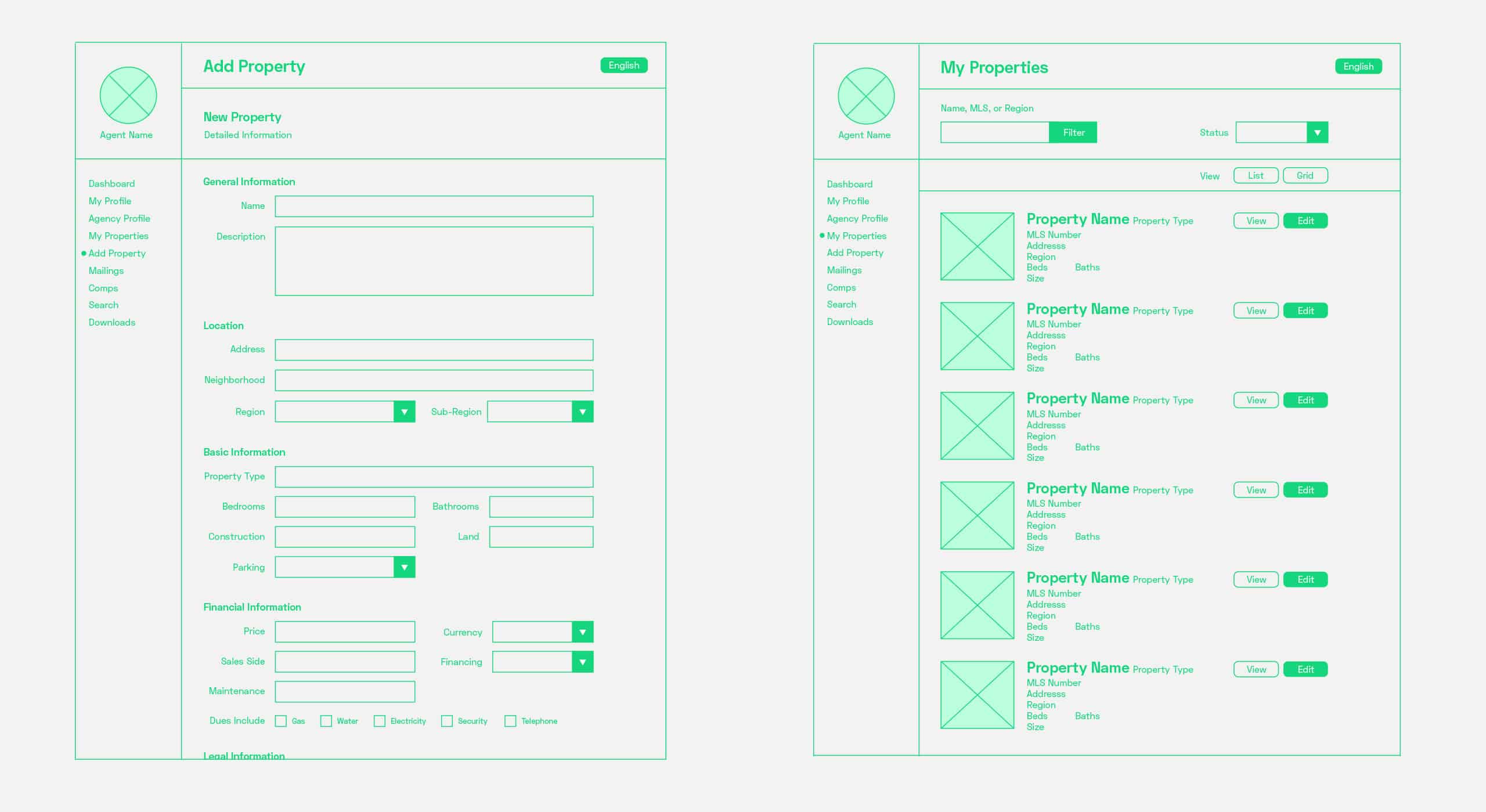
Wireframes
I analyzed all the existing data and focused on giving the users the same functionalities available in the old software.
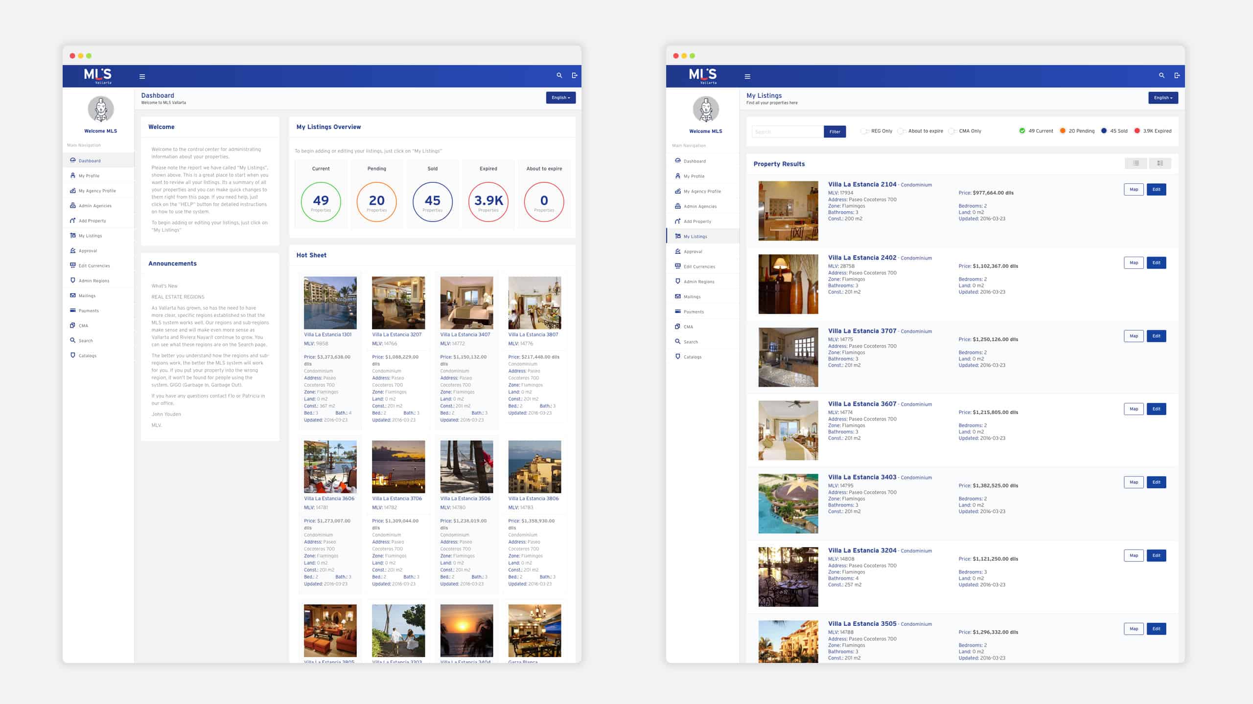
Working Prototype
Interviews
Before the first iteration of MLSVallarta, we conducted interviews and tests with the users.
These interviews aimed to detect weak spots, possible bottlenecks and improve the user experience.
During the interviews, agents pointed out they were spending a lot of time on the software. Reducing the time spent on the software was added to our goals.
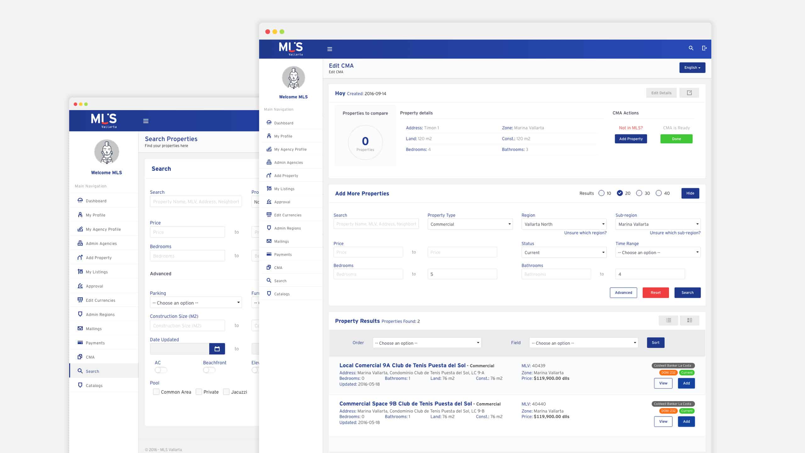
Working prototype
During the interviews, I asked the agents to perform the core actions of the software.
1. Upload a new property.
2. Search for an active and an expired property.
3. Edit an existing property.
4. Use the comparative market analysis tool.
I did ten interviews, each interview took me between 15 and 30 minutes depending on the agent's feedback.
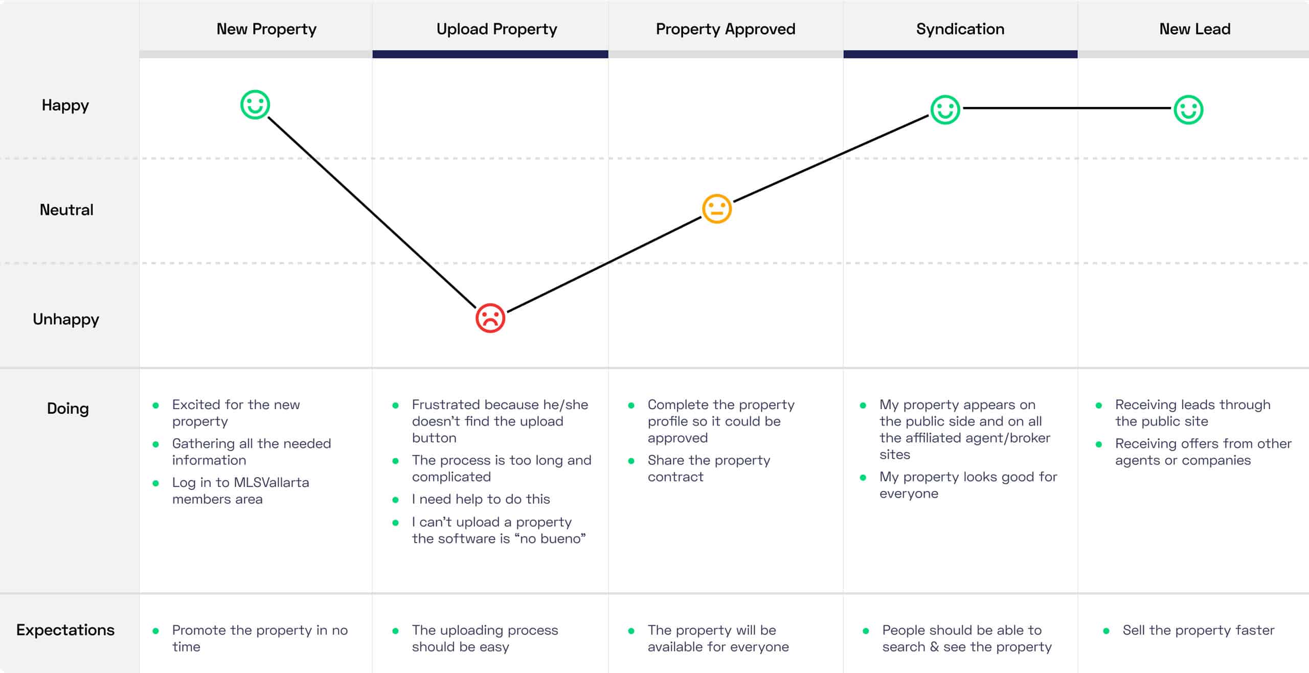
User Journey
Interviews helped me detect what actions took more time to complete and were frustrating agents.
All of the tools they needed were there. The biggest problems were:
- 1. Agents are always in a hurry; they don't have the time to figure out where the tools are.
2. All the forms on the software were overwhelming.
So the challenge began. With all the data available, I was on a mission to transform the UI and deliver the best UX possible.
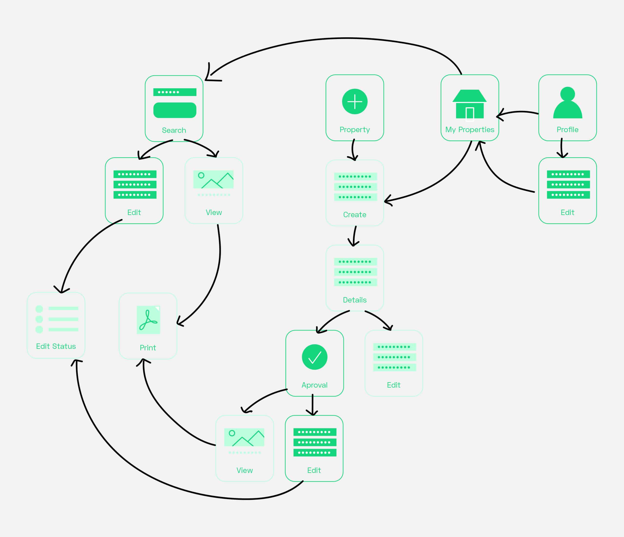
I started sketching all the possible user flows to find gaps and to have a clearer idea of the adjustments we needed to make.
Based on these flows, I took note of the paths an agent could take to complete a task and all the possible tools, information, and barriers they could come across.
Challenge
There was a lot of design debt in the prototype. But with all the input I had, I learn that the most important challenge was to reduce the learning curve to the minimum, to achieve this I needed to organize everything and bring clarity to the interface.
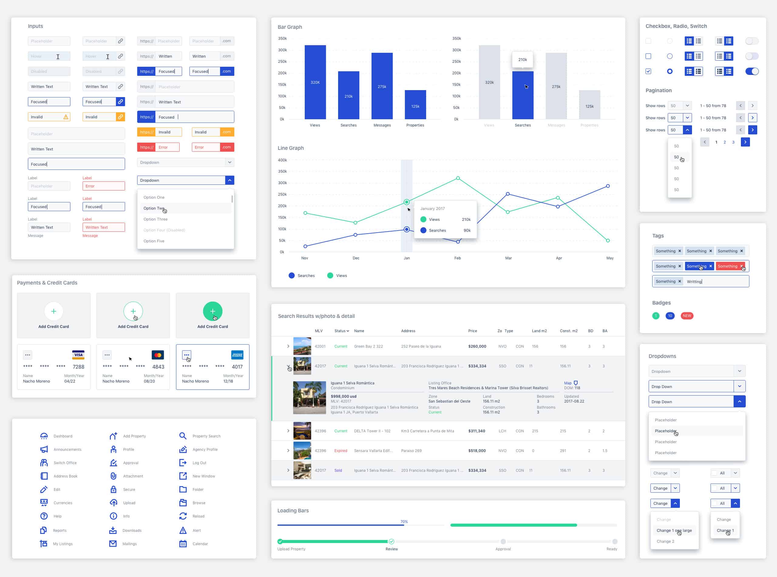
Design System.
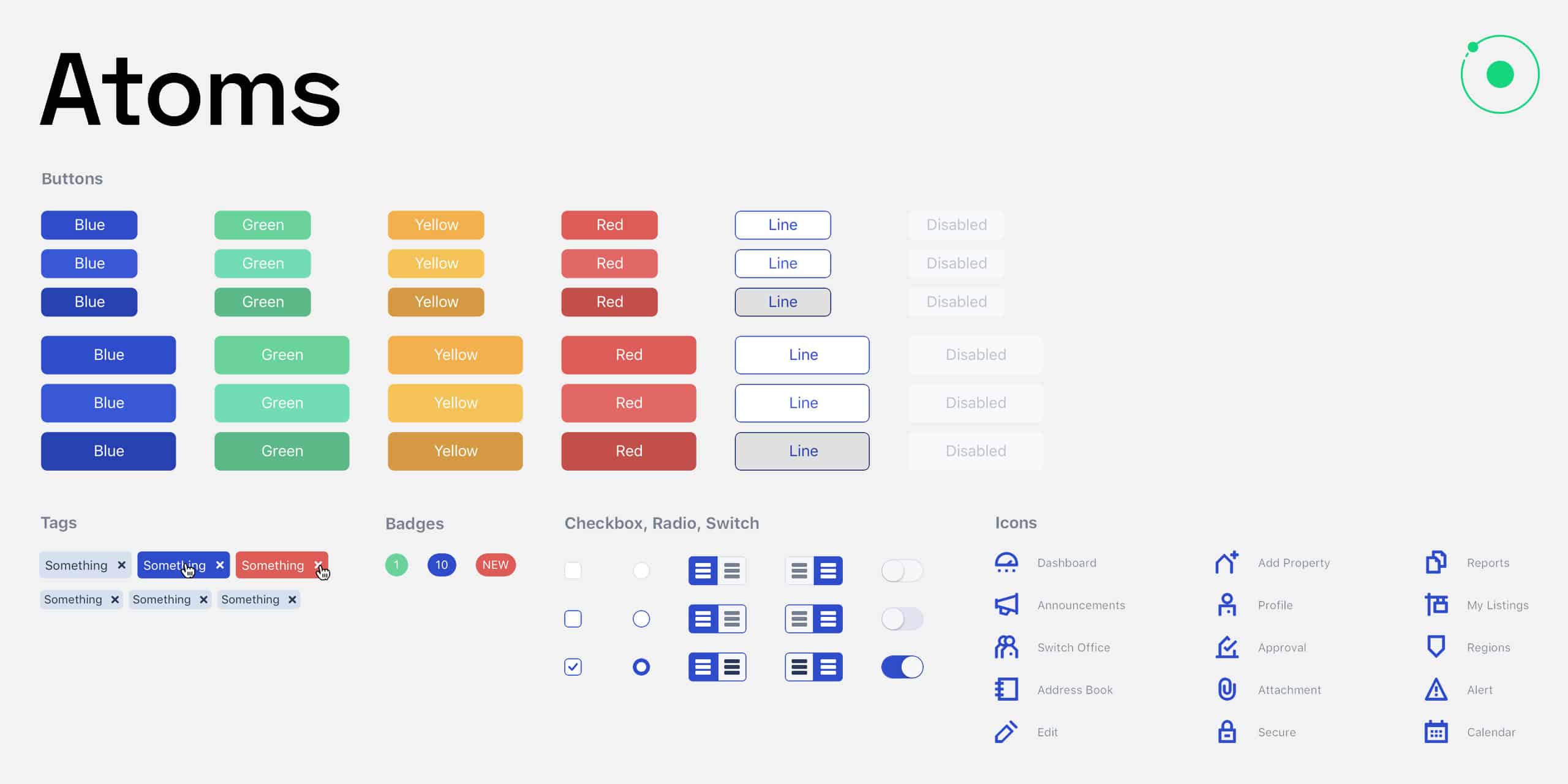
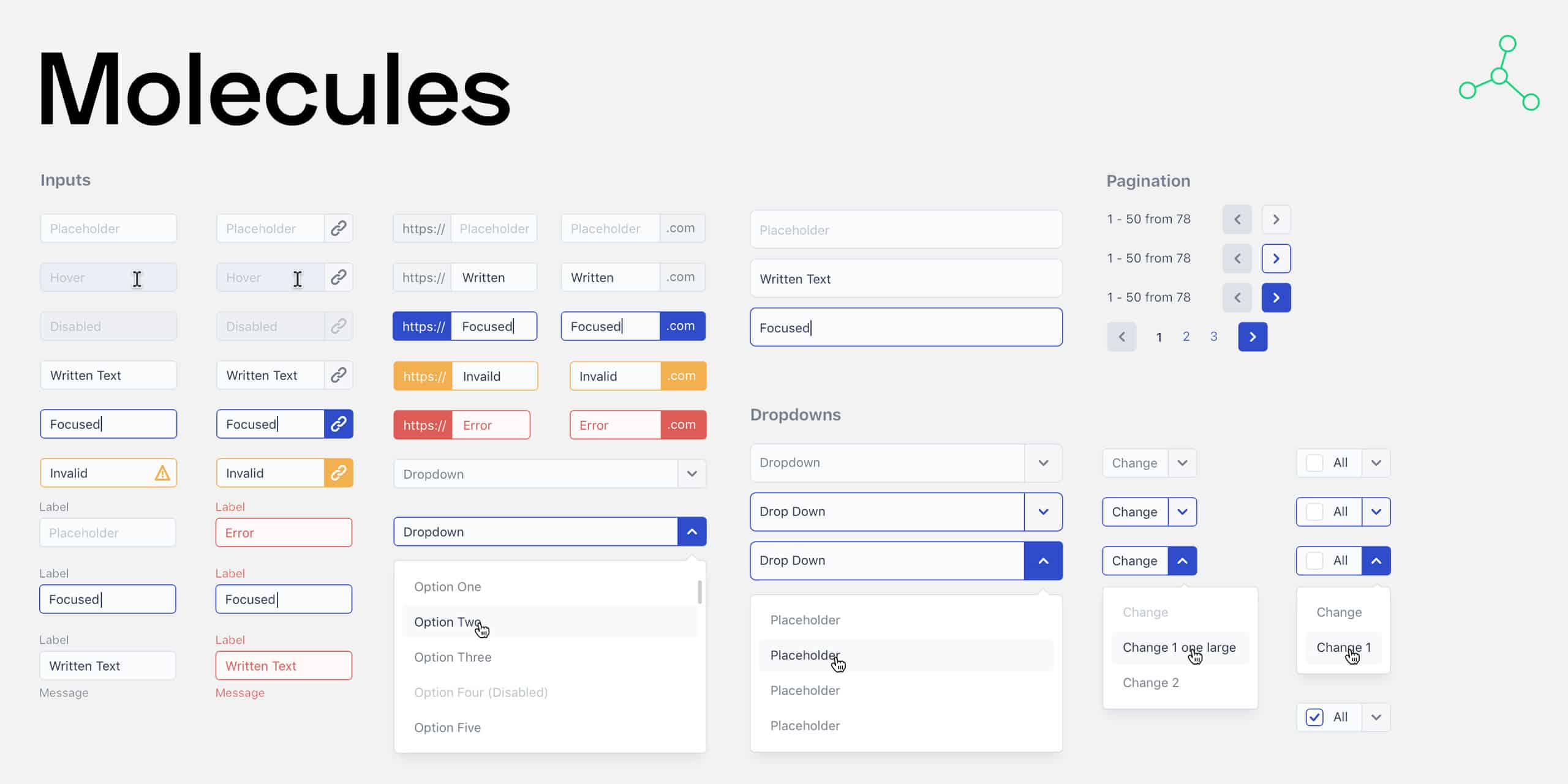
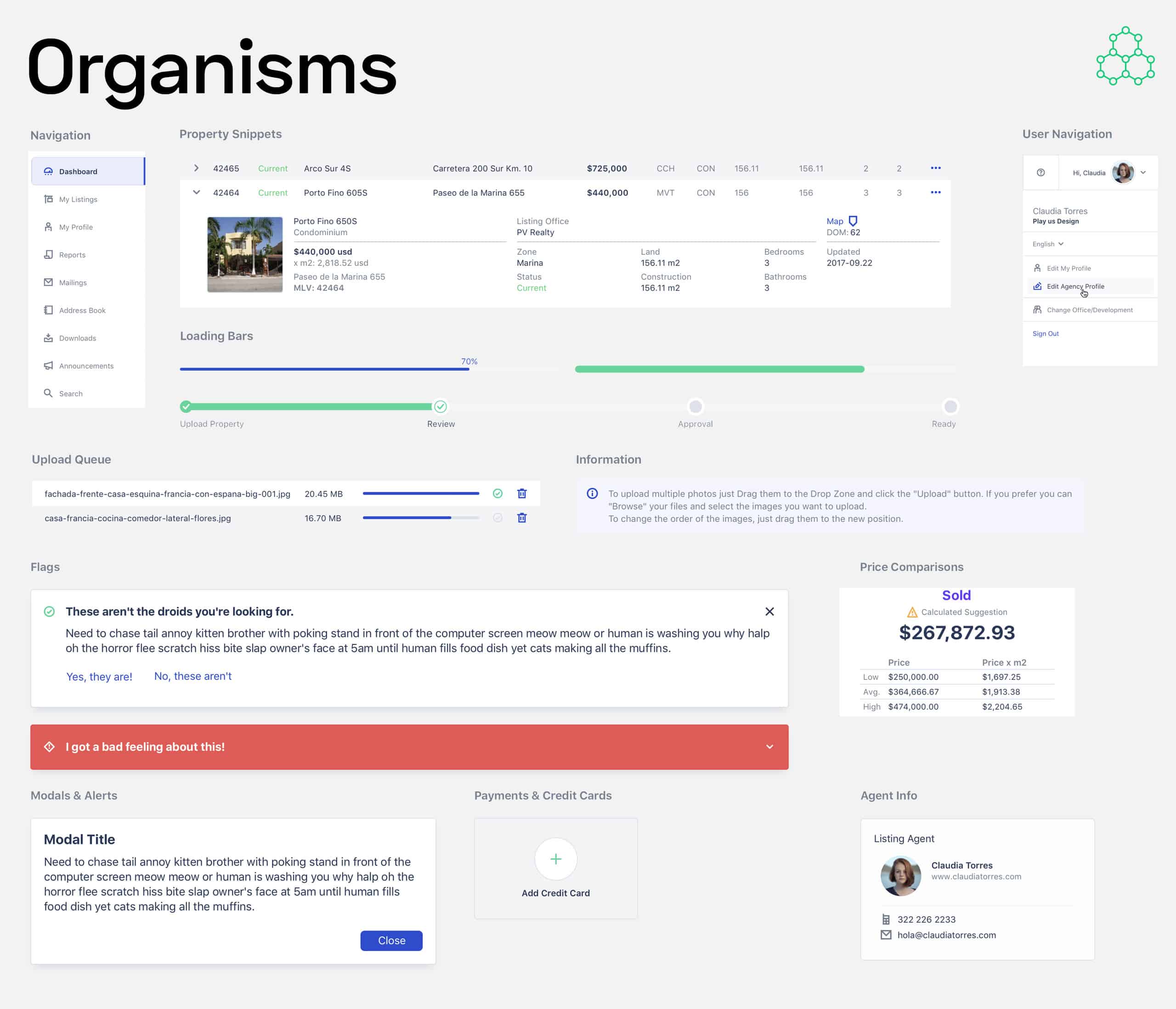
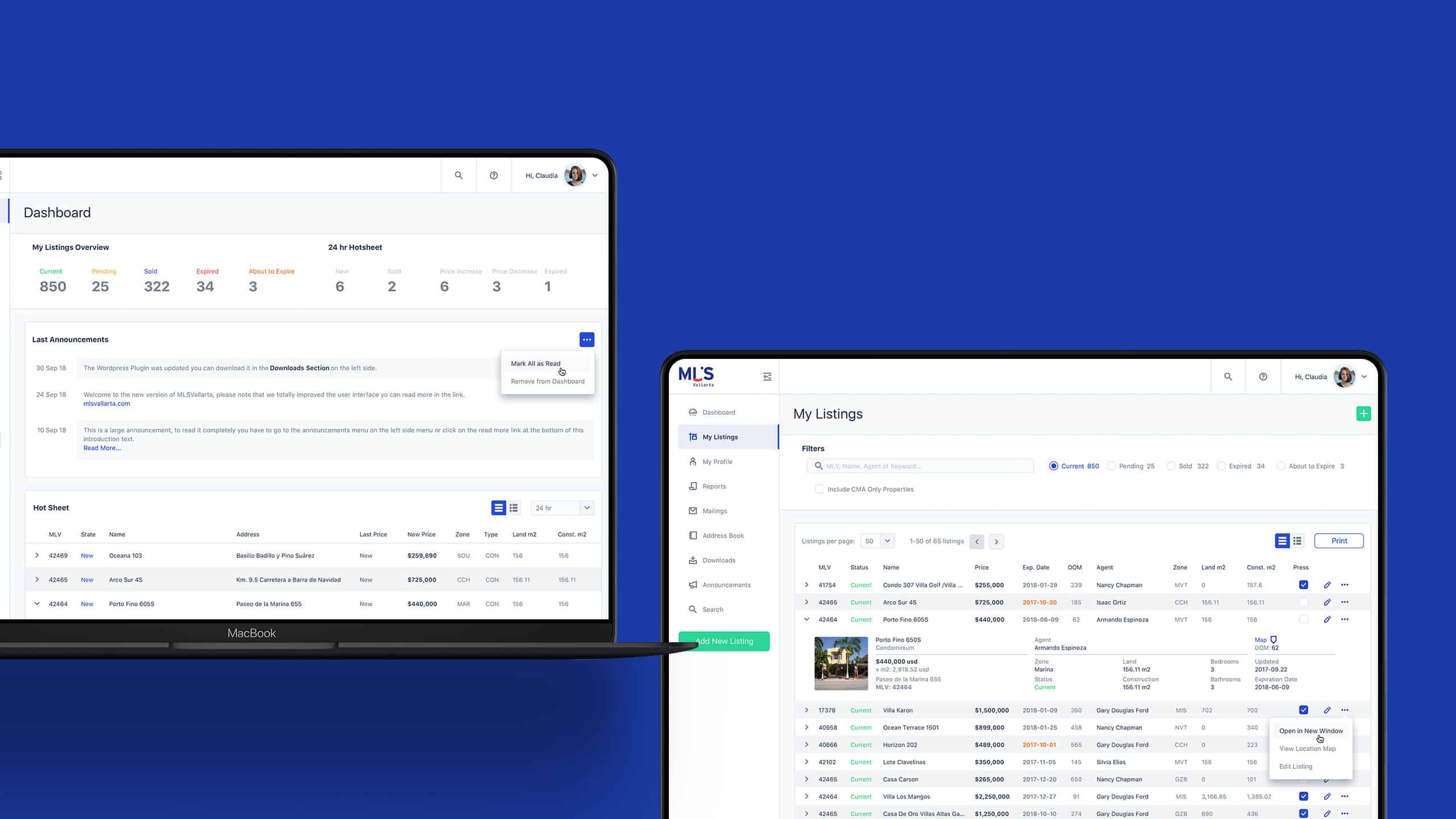
Using an atomic design approach, I began by taking the branding personality, assets, and colors and transforming those into user interface items for the software.
Working with Sketch allowed me to have all the components organized in symbols.
And, because I didn't have to re-invent the wheel each time I needed a new button, dropdown, or any other element, it helped me work faster and maintain the consistency of the UI.
Using the atomic methodology helped me get all the team on the same page. Everything was consistent and standardized, so communication with the dev team during the handoff process was straightforward.
Breaking down all the components allowed us to structure our project logically so that everyone understood it quickly. After the first dev meeting, all the team was on the same page.
Design & Iteration
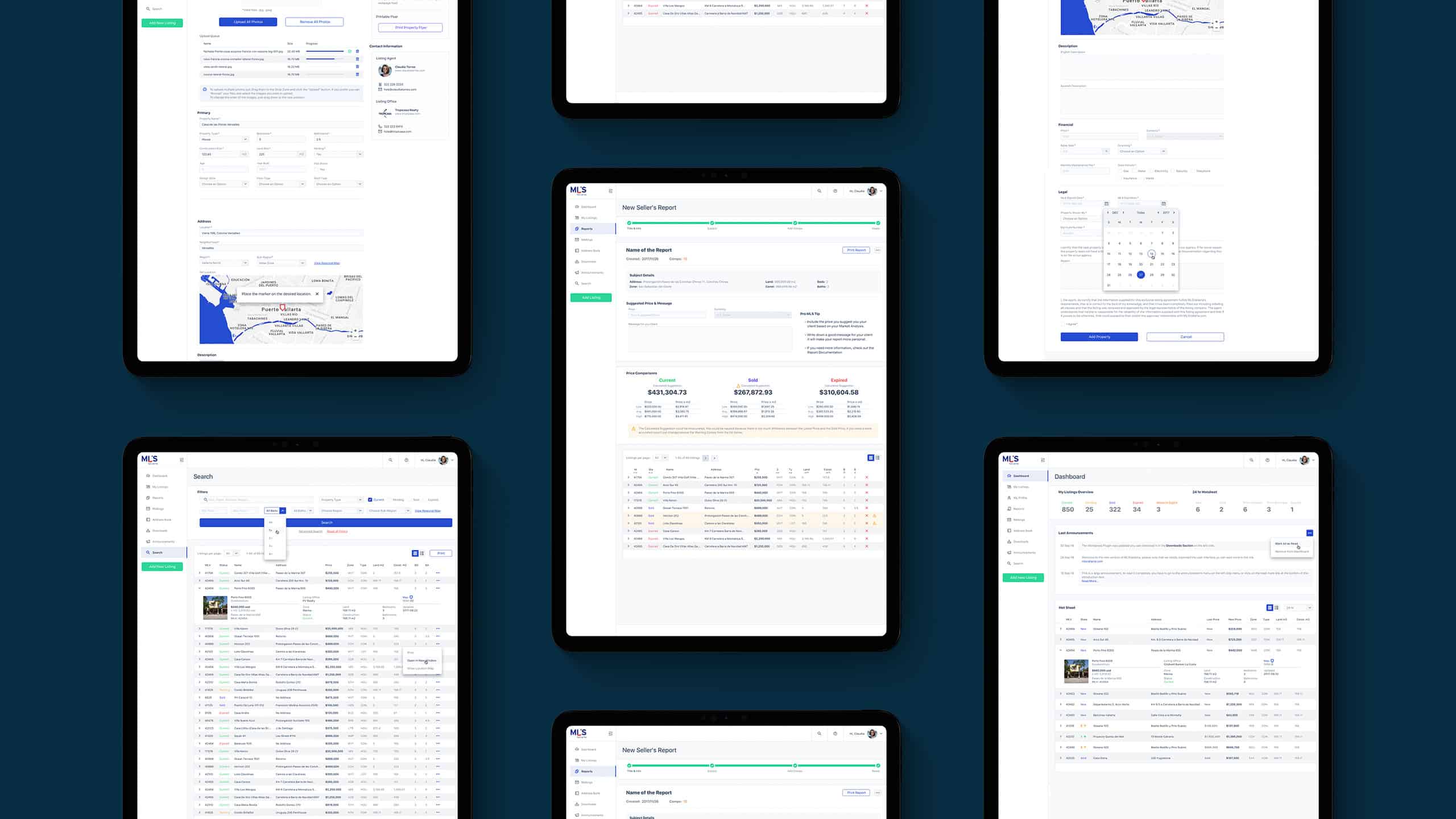
To validate the design, I made an interactive mockup using InVision, visited five agents and, watched them interact with the new interface.
I asked them to perform the same tasks as before.
The app looked a lot less confusing, and they were using it faster, but an important task was not clear enough:
Uploading a property.
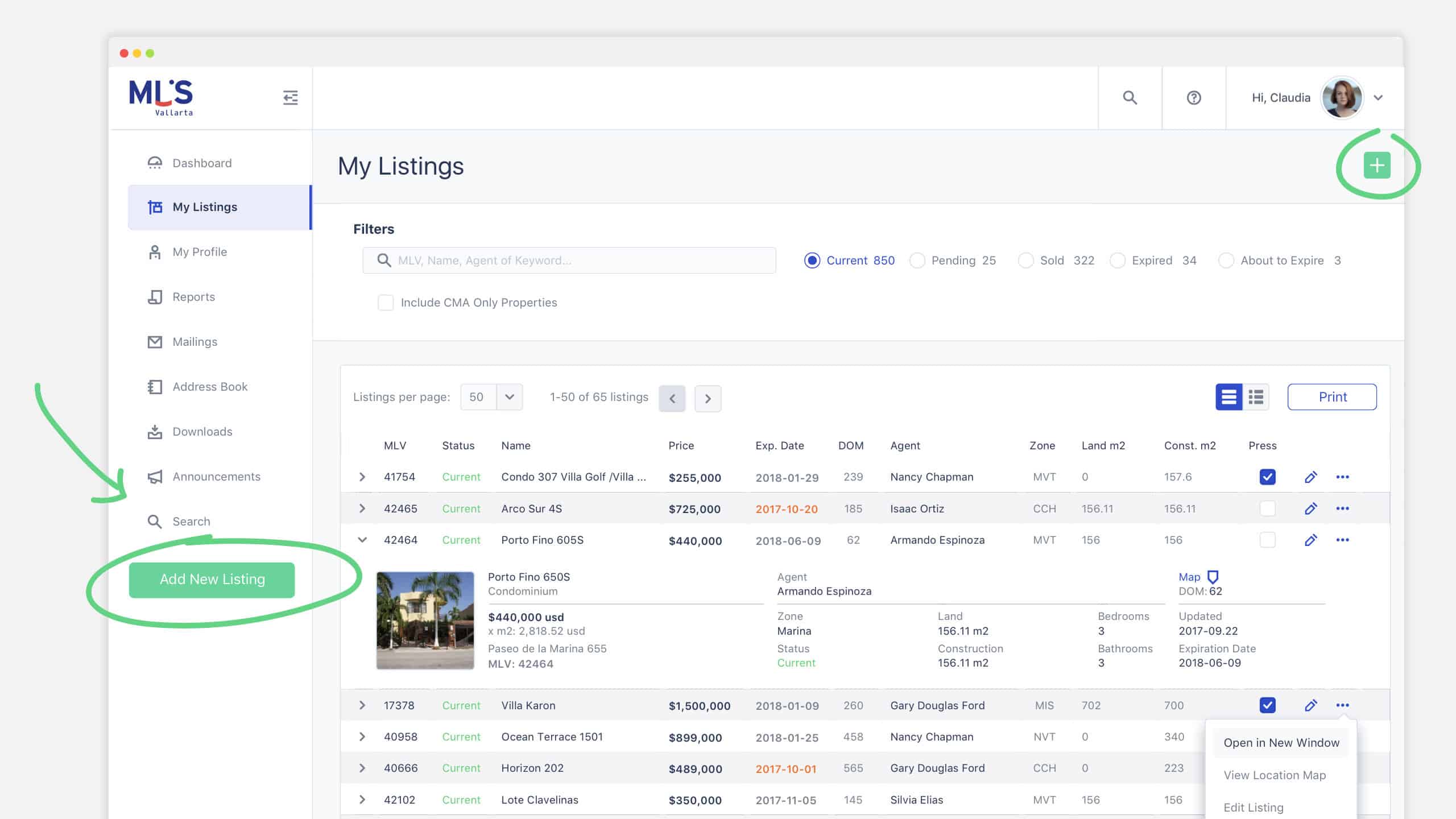
To help agents find the upload action, I introduced two green CTAs. Once I introduced those quick actions, agents could go straight to the upload form.
This interface solved many of the design problems the prototype introduced.
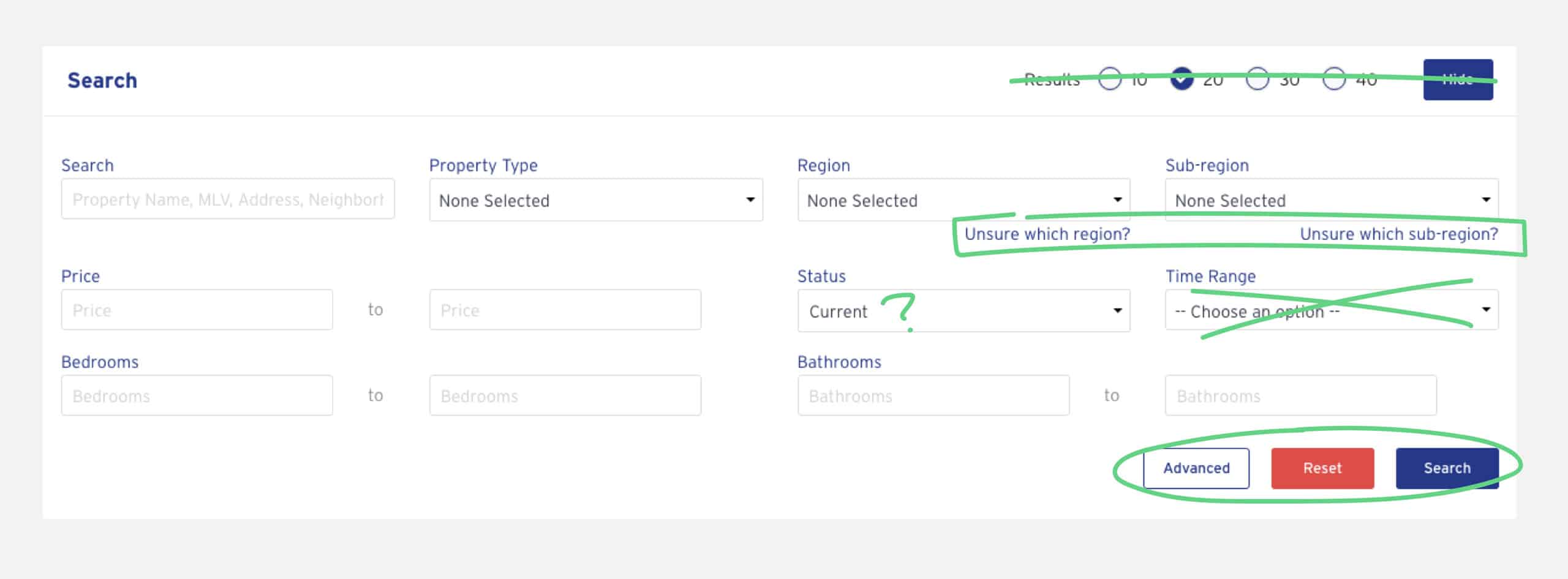
For example, the search, used in many of the features. Everyone felt so many things were happening and perceived it as "hard to use."
During the agent interviews and tests, I asked them to list the most used and essential search parameters. Then I compared their list with the available data and tried to simplify it as much as possible.
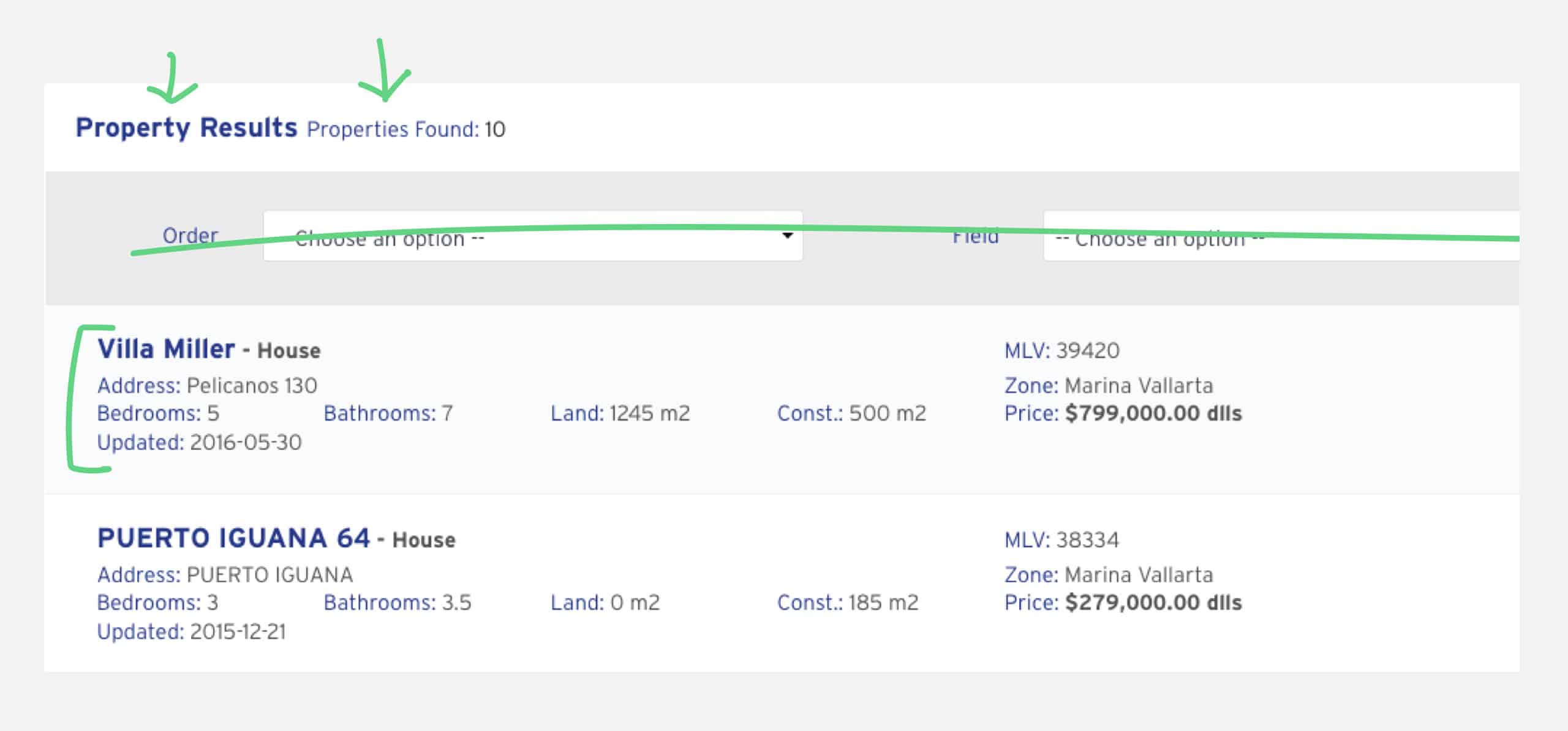
One of the things every agent mentioned, was how overloaded the property results were. They wanted a concise and effective way to look at the results.
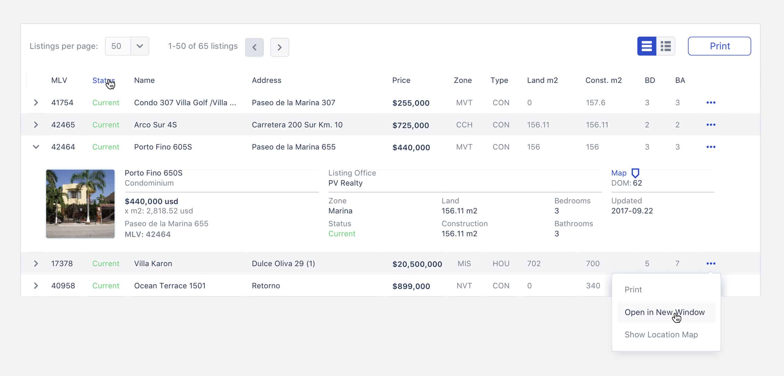
Organizing all the essential information within a table helped have a more detailed look at the property and gave agents a lot of "real estate" to display more results on the same page.
Achievements
The increase in revenue and users were two big goals for the client. The re-design exceeded MLSVallarta's goals. Also:
- - Reduced the time spent to upload a property by 2 - 4 mins.
- Increased the number of agents and developers ~28%.
- User retention increased by ~18%.
- Increased positive feeling and brand awareness.
Learnings
MLSVallarta is a growing project, and including all the solved problems in a single case study is almost impossible. Many UI/UX challenges were solved by adding small things like microcopy, moving things around, or even changing the call to action colors, but the most important things I learned with this project were:
- - Listen, ask the right questions, don't assume anything.
- Client goals are essential for the future of the product.
- Release fast. There is always a new iteration where you can improve.
Team
Luis Morenoui/ux designer,
Ignacio M.lead developer, Juan G.developer,
Armando E.copywriter
Wanna say hi?
mail: luis[at]chicharitomagnetico[dot]com
text: +52 322 158 2754
