California Homes
The magazine of architecture, the arts & distinctive design.
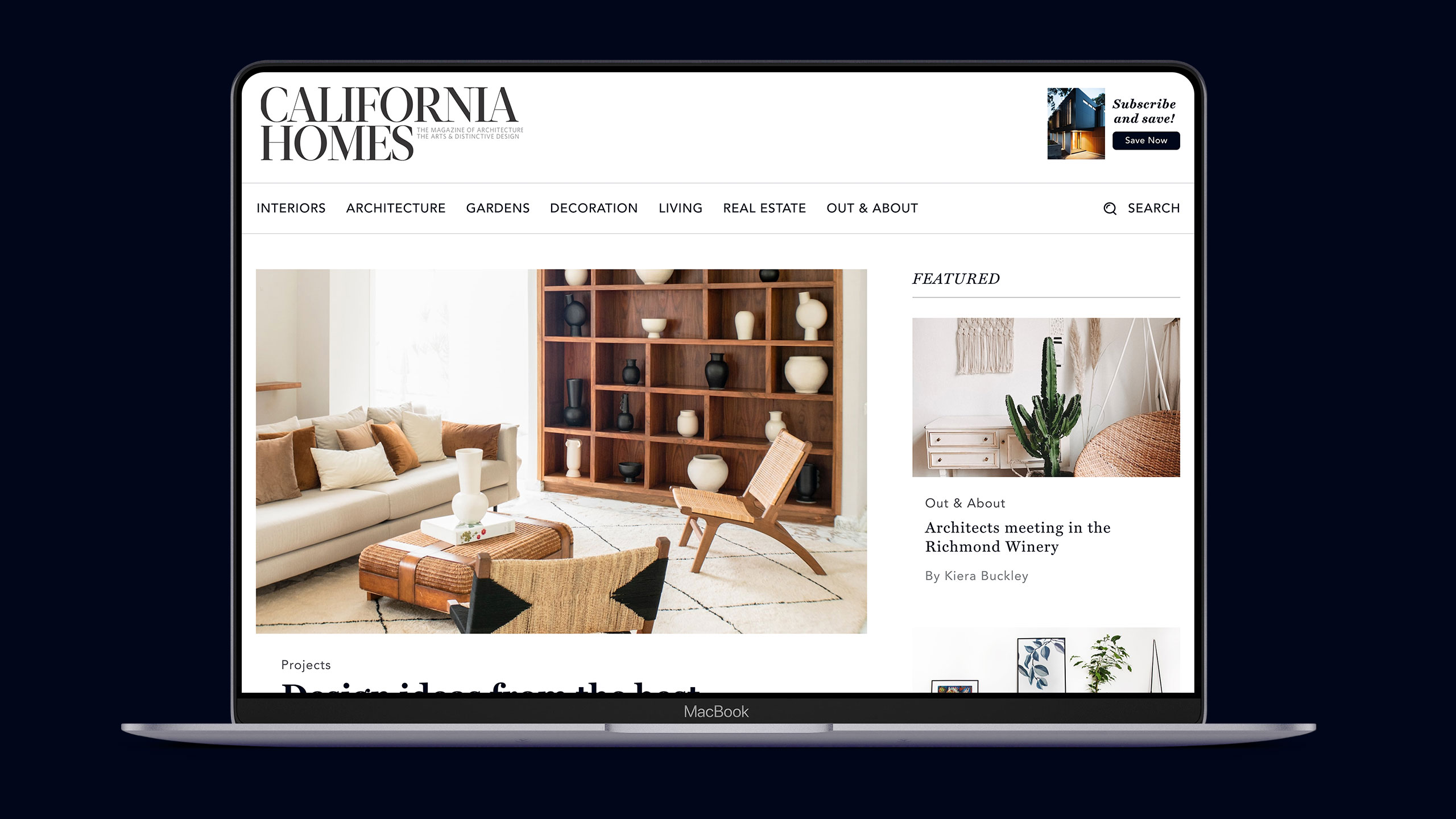
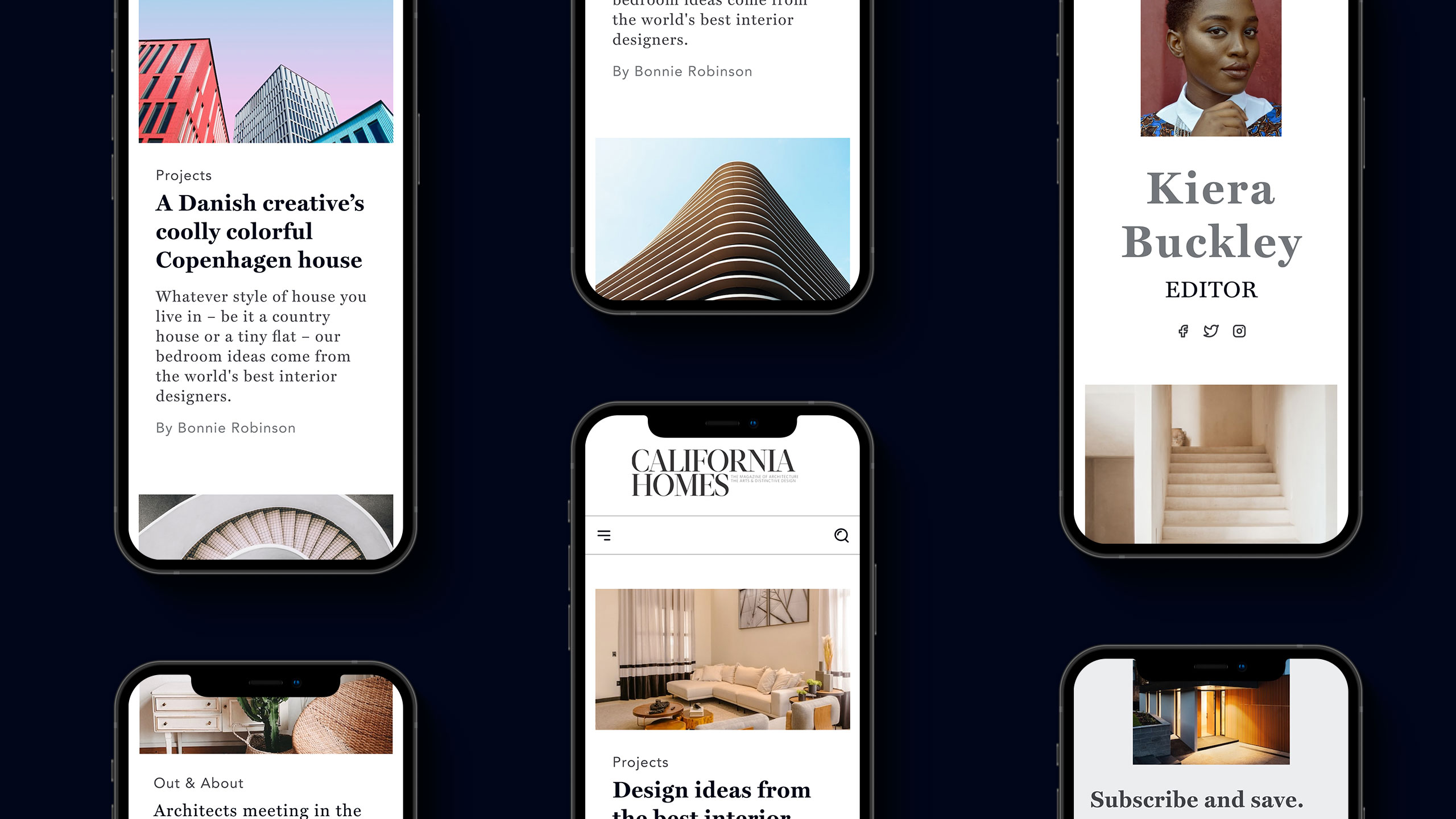
California Homes is a well-established magazine that required a stronger web presence and needed to connect and attract a wider audience.
During the research process, I understood that this project would open new market opportunities for the company shortly, so they must have a clean and professional look to maximize their possibilities to compete with other companies already in the market.
From physical to online, designing a magazine requires some thought. Besides pushing pixels, you spend much time designing the structure and how the content will be distributed through the site. Sure, having the physical magazine helps, but you must think about sections, taxonomies, hierarchies, and how to present and optimize the information for the visitor and search engines.
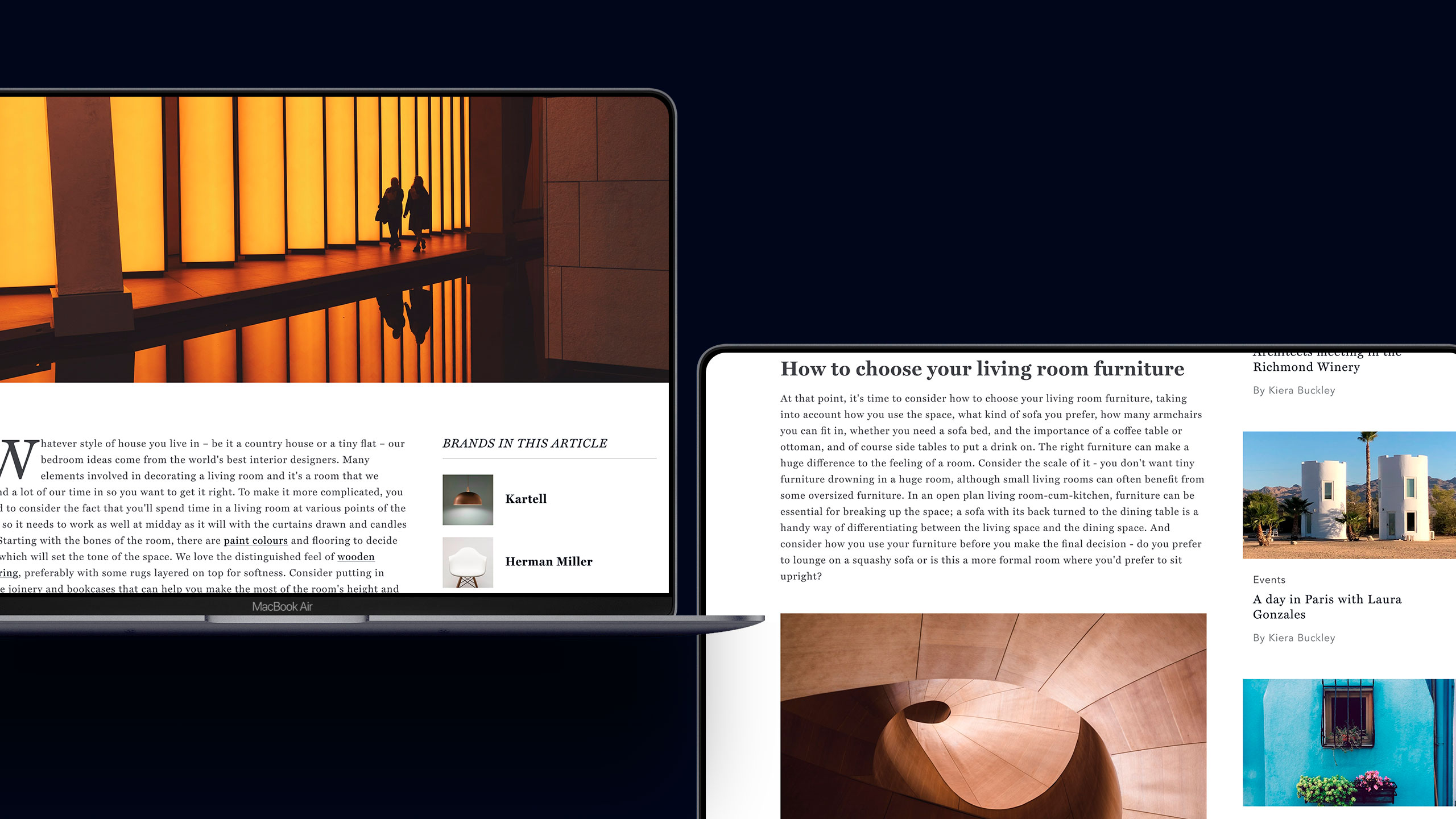
California Homes Articles
One of the project's most significant challenges was working with a team that needed to gain experience publishing or managing a website. To alleviate the process and help me explain how the content will be distributed along the site, I had to work on reducing the navigation flowchart to its simplest form.
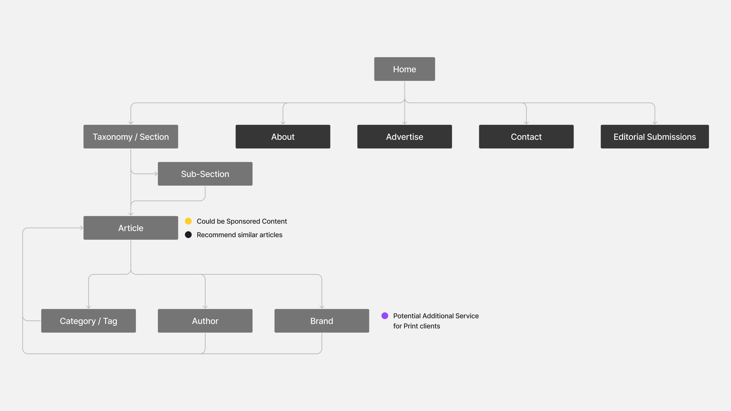
California Homes Basic Navigation
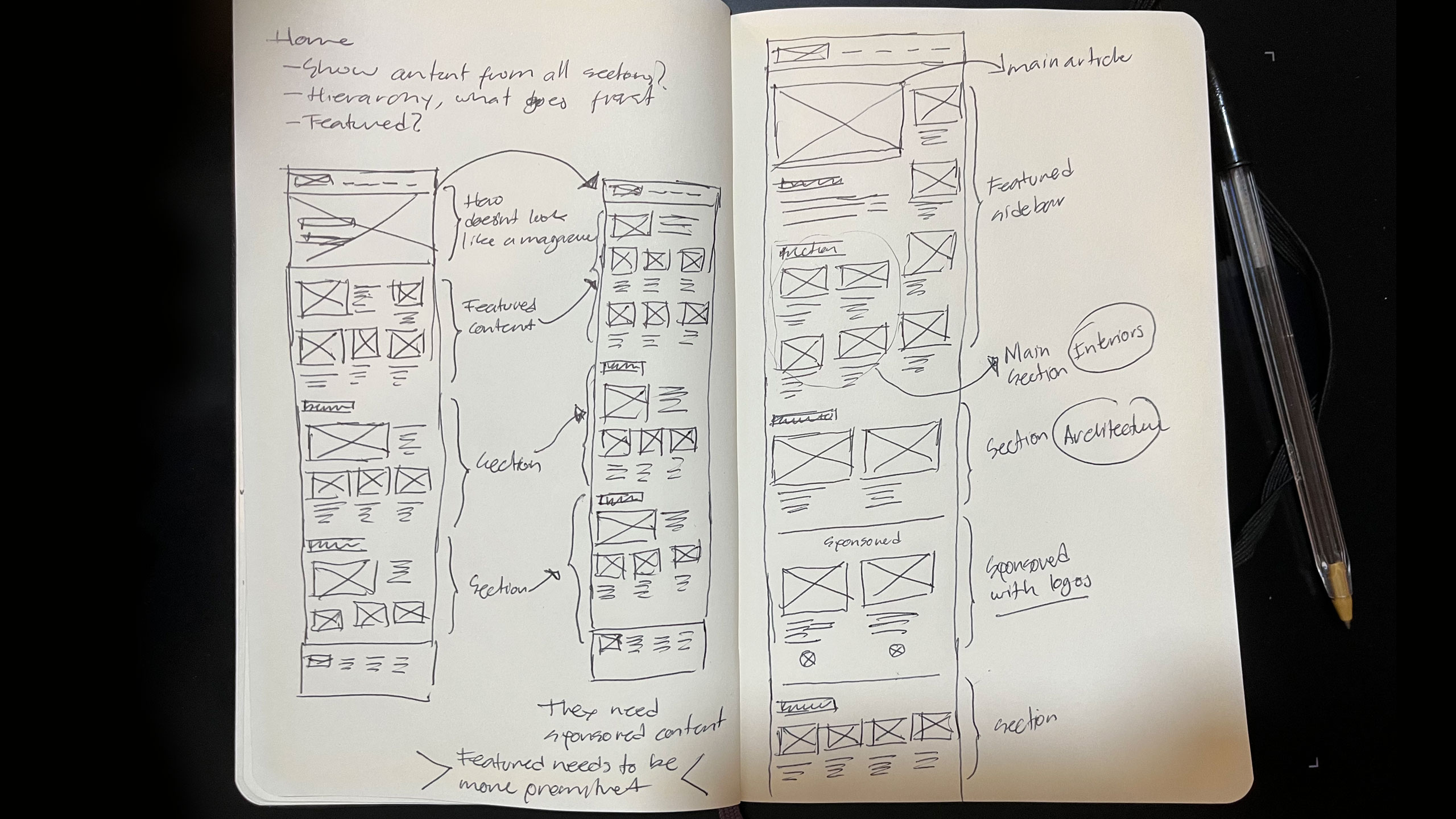
Once the navigation was defined, there was still the usual debate about what content should be featured on the homepage and how it should be presented. There were two requests that I could not ignore.
- 1) They wanted featured articles, which should be curated by their team manually.
2) Don't forget California Homes is mainly an interior and architecture magazine, so those topics should continue to be the main focus.
As usual, I started making quick sketches of how the home page should accommodate the information and iterated the layout based on their feedback. I always find this process quicker than going straight to Figma to work on the wireframes. At this point, I was taking pictures of my sketches with my iPhone and sharing them with the client. It was a very rough but efficient method. It only took me three iterations to get to the correct layout.
I went through this process for almost all the website sections. Making sketches may be an extra step for many designers (even when everyone should do them), but it saves you a lot of time.
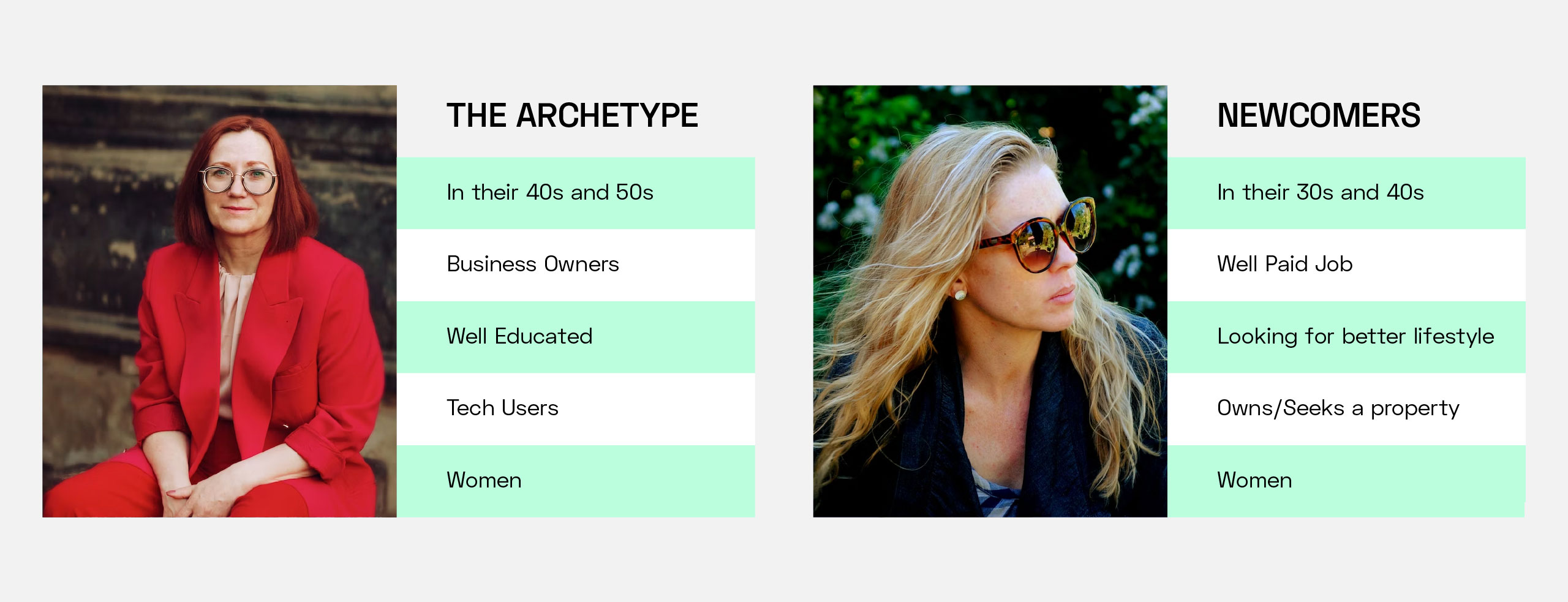
Since California Homes has a long trajectory and its team has a lot of marketing experience, they already know their audience very well and know who they are talking to; that is not a benefit I see many times. Synthesizing the data they have collected through the years, I created a user persona that was the typical archetype of a California Homes magazine buyer. Still, since an online publication behaves differently, I also saw the need to create another persona that allows us to cover a wider audience.
- 1) The archetype: People in their 40s and 50s, successful in their jobs or business owners. Mostly women with an interest in decoration and high-end lifestyles. Well-educated with access to technology and the Internet, iOS, and Mac users.
2) The newcomer: People in their 30s and 40s, single or with a small family, starting a business or working in a well-paid job. Mostly women looking to improve their lifestyle, seeking to own a house or move to a bigger property. Well-educated, with easy access to the Internet, and uses technology for almost everything. iOS and Mac users.
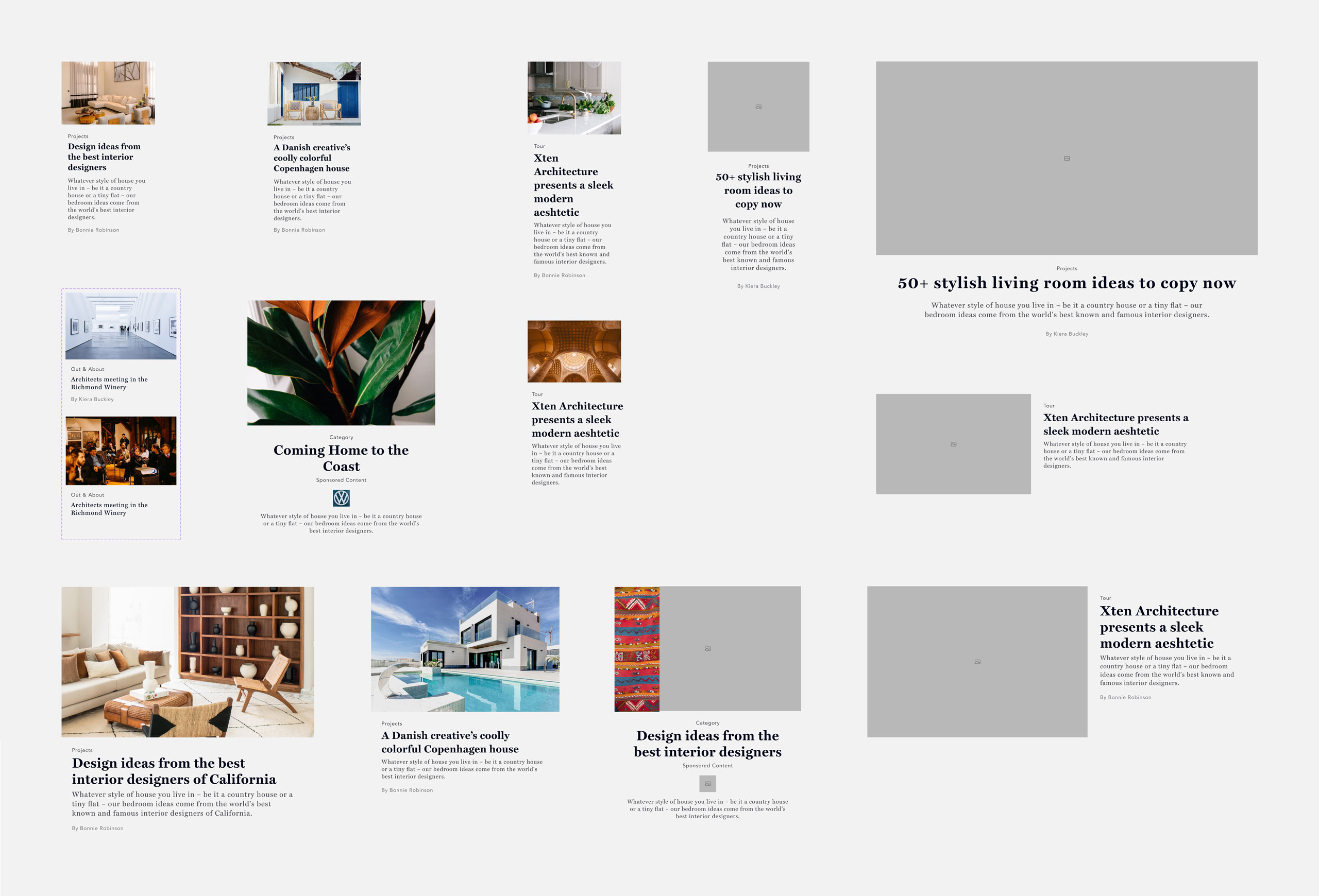
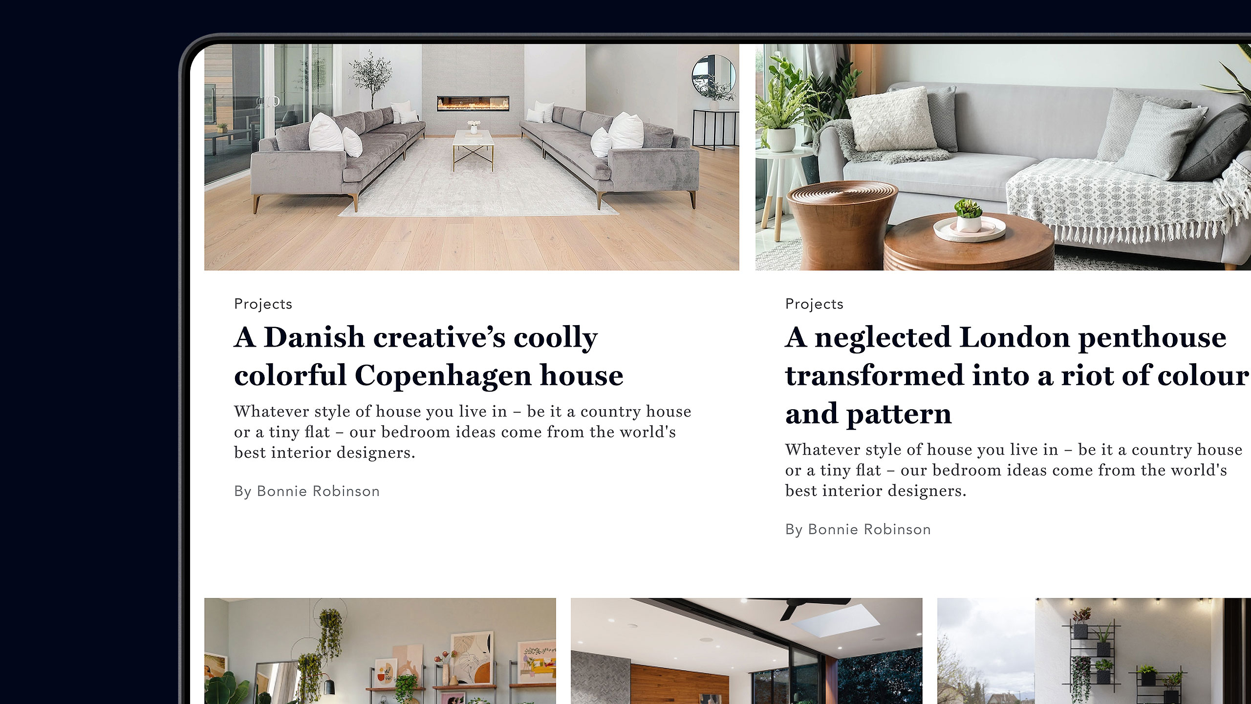
The design approach for this project was very similar to what I did for IndieRocks! I broke each section's layouts into smaller organisms containing the primary information of each article. I separated all article and page content into components or blocks, ala "Gutenberg style" from the beginning of the design process. Apart from speeding up the designing process, using this process is very helpful when working with a dev team because it is easier to document and explain everything.
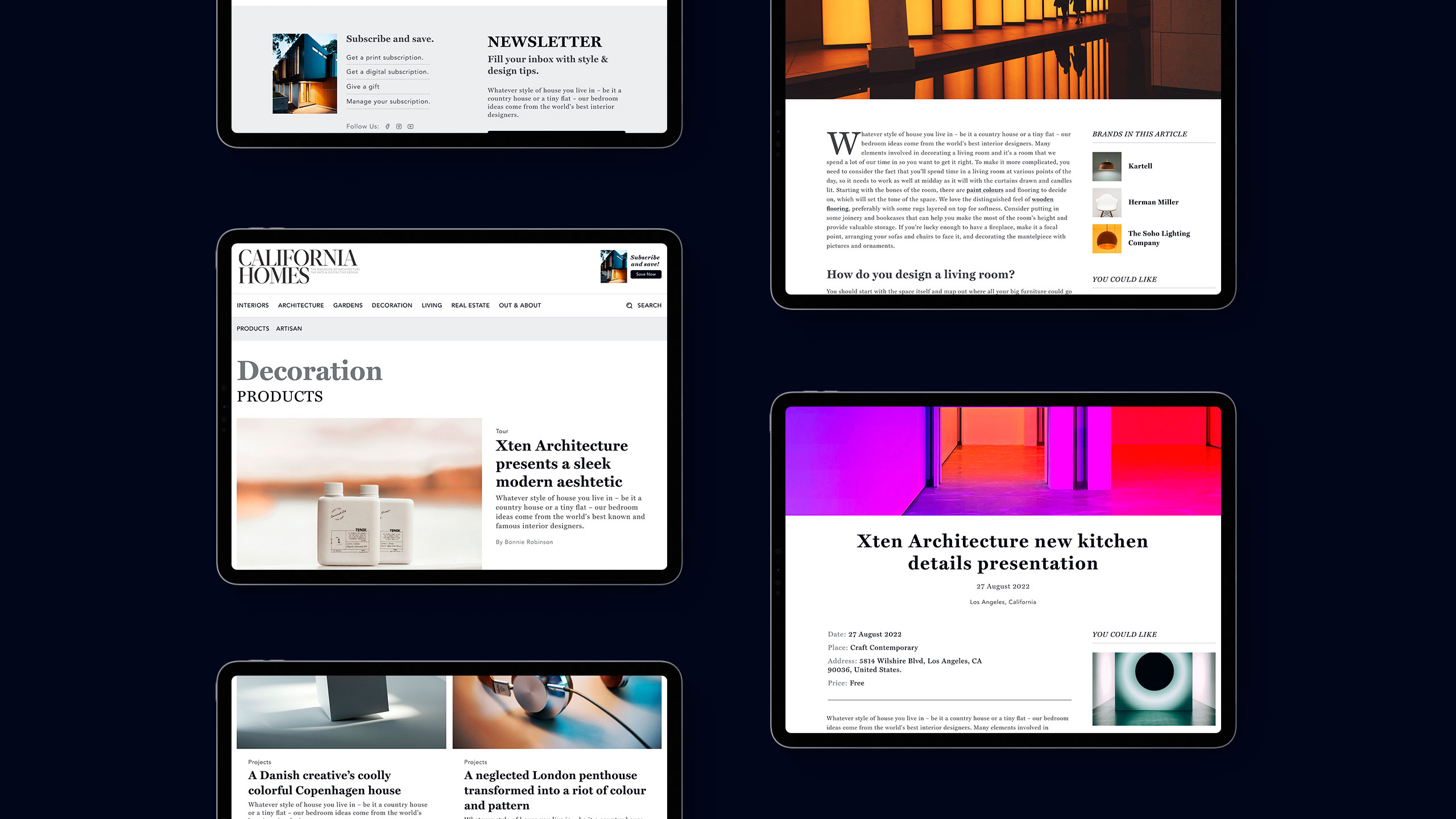
Because the website is an extension of the printed magazine, the California Homes team was conscious of what they were looking for in the design. They know the value of any publication is its content and writers, so I worked with them on how the information would be presented to their visitors. Breaking the content of the articles into smaller components was helpful from the design and dev point of view, and it also gave them the tools and flexibility to add different content blocks and build their article more dynamically.
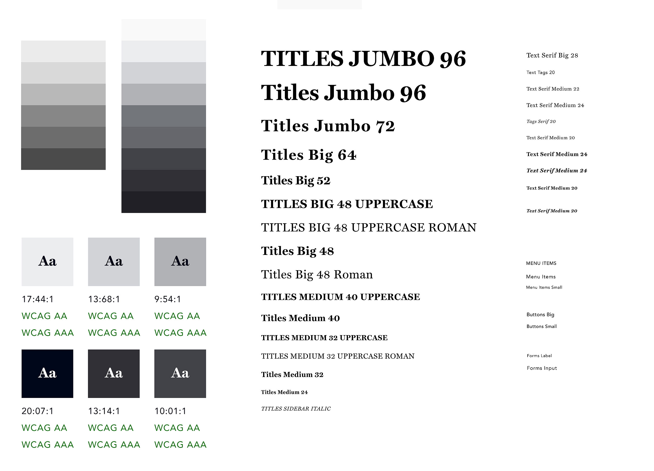
During the design process, I had to discuss how to use typography and color in the website with the California Homes design team. After hearing what they wanted, based on the personas and accessibility standards like spacing and contrast, I established a color palette, font sizes, and a guideline on using colors in the website to meet at least the WCAG AA standard.
By doing this and advising the dev team on using semantic markup, tags, and the appropriate labeling of media, the site could comply with the California Assembly Bill 434 WCAG.
The design of the California Homes website allowed the company to start a new business in the digital space and to offer its clients new benefits to complement the printed issues.
The design of the California Homes website allowed the company to start a new business in the digital space and to offer its clients new benefits to complement the printed issues.
Personally, I enjoyed expanding my knowledge of accessibility standards and learning why meeting those standards is a must for any company website.
Team
Luis Morenoui/ux designer & font end developer,
Ignacio M.lead developer.
Agency
Coupar Consulting
Wanna say hi?
mail: luis[at]chicharitomagnetico[dot]com
text: +52 322 158 2754
